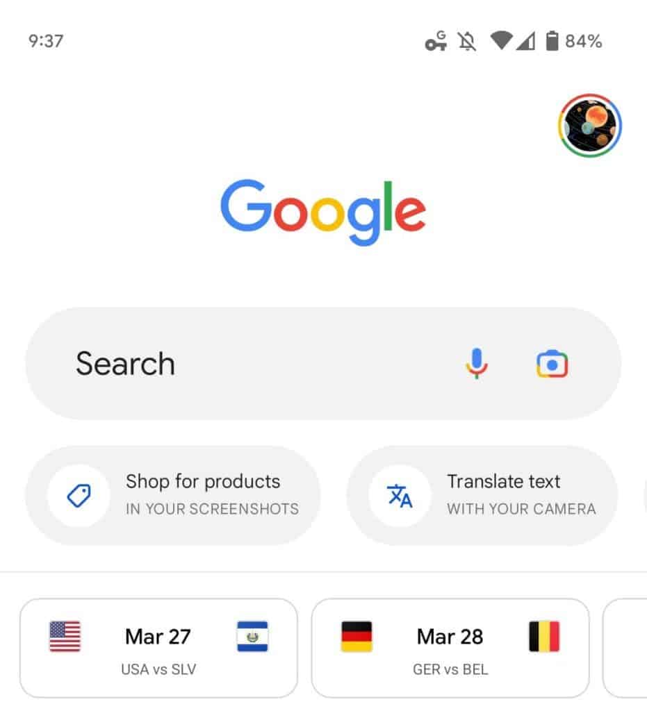
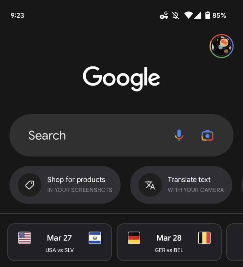
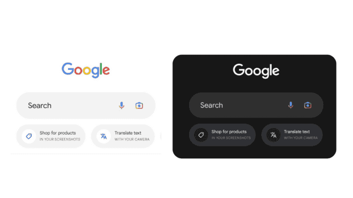
The Google app on Android needs a Material You redesign, but for now, it got a comically large Search bar. The Search bar is almost twice as tall as the standard-sized pill, and the “Search” hint is also in a larger font. The microphone and Google Lens icons look small compared to the oversized Search bar.
Google App on Android Now Features a Large Search Bar and Google Lens Suggestions

Google has added a carousel to the app that features suggestions related to Google Lens, such as shopping for products in your screenshots, using your camera to translate text, searching photos from your library, solving homework with your camera, and identifying a song by listening. Tapping on any of these suggestions launches Lens immediately.
This change has already been on the Google iOS app for some time. But it is now available on Android with the latest Google app beta (version 12.14). However, it is not yet widely rolled out.

The functionality of the app remains the same, but the oversized Search bar may provide a bigger touch target that is beneficial for some users. However, some users may not like the descriptions for each suggestion being in all caps and screaming at them. Hopefully, these descriptions will disappear over time and not be a persistent reminder.
Overall, the new Search bar design and Google Lens suggestions are a significant update to the Google app on Android. While some users may not like the oversized Search bar or the all-caps descriptions, others may find the larger touch target and the easy access to Google Lens useful.
Google may receive feedback from users on this new feature and make changes to it based on their input. For now, users will have to decide for themselves whether they like the new design or prefer the old one.


