Nothing Phone (2) has been generating buzz in recent weeks. While the device is confirmed to be released on July 11, the company has been pushing ahead with aggressive marketing. Even the CEO, Carl Pei, has been teasing the phone from his Twitter account.
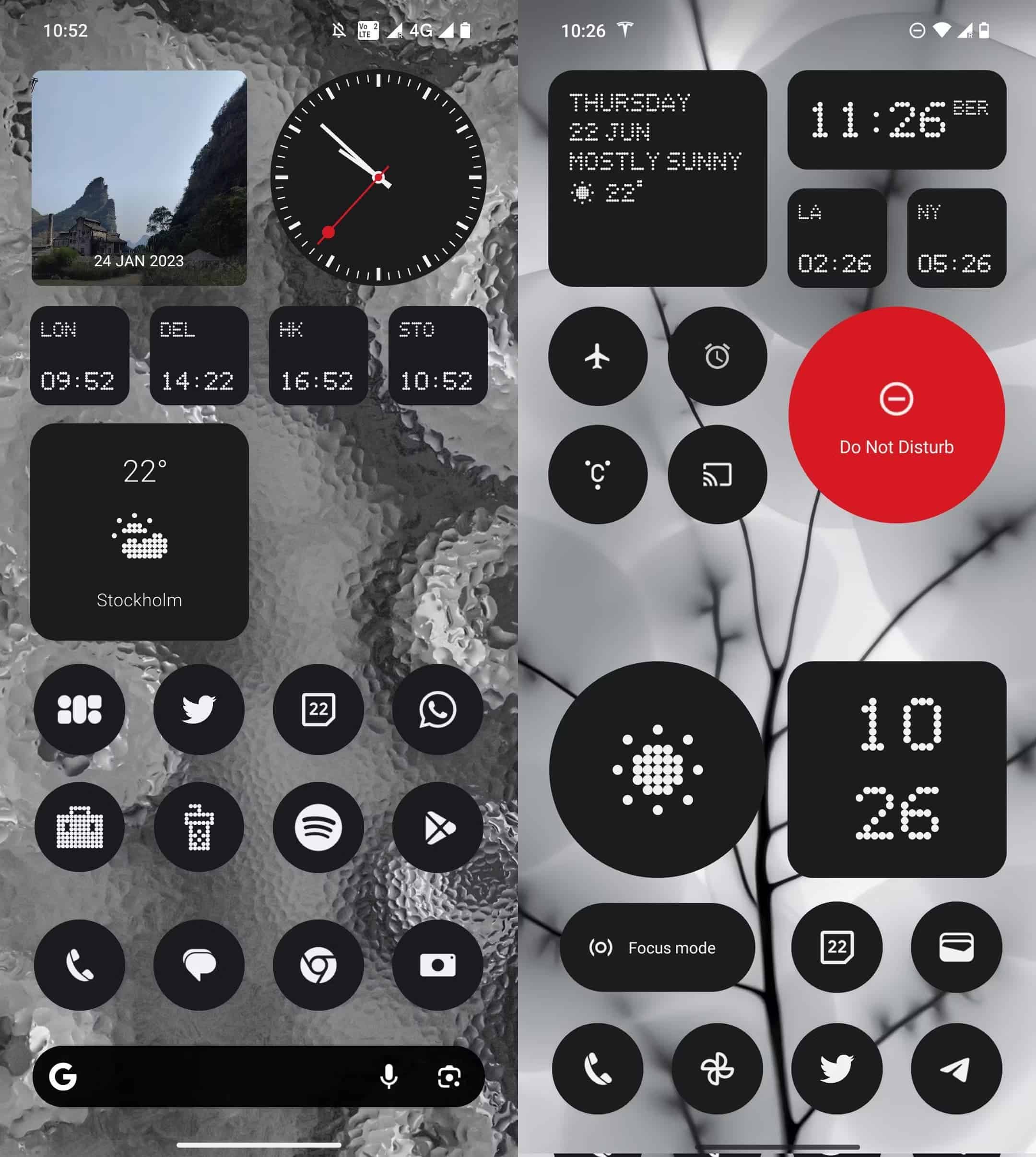
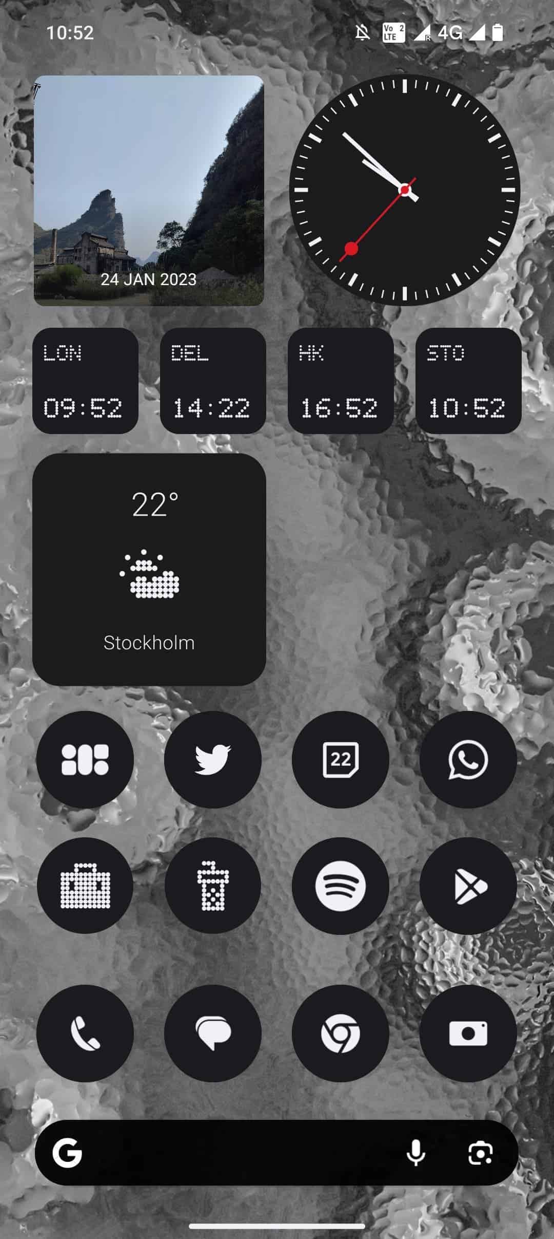
Among the most recent teasers from Carl Pei, you have a home screen screenshot of Nothing OS 2.0. And in case you don’t know, it’s the Android skin that’s due to release along with the Nothing Phone (2). So, what’s the big deal with this screenshot? It reveals key design information about the upcoming phone.
A Closer Look at the Nothing OS 2.0 Screenshot
Interestingly, Carl Pei is not the first person that has revealed the screenshot of Nothing OS 2.0. Earlier this month, the software creative director of Nothing had an interview with the XDA. In that interview, Mladen Hyoss shared that the team wants to “start almost from scratch” for Nothing OS 2.0.

And on June 22, Hoyss shared a screenshot of the home screen. Upon closer inspection, the screenshot shared by Hoyss matches the one shared by Carl Pei. That confirms that Nothing OS 2.0 is almost ready for launch. Likewise, it indicates that Nothing Phone (2) is ready too.
What Does the Screenshot Reveal?
The main thing about the screenshots shared by Carl Pei and Hoyss is that it indicates a design change of Nothing Phone (2). By taking a closer look, you will see that the home screen clock is non the top left side of the screen. On the other hand, the battery, cellular information, and other icons are on the right, leaving the middle empty.
This indicates that the Nothing Phone (2) front-facing camera will be in the middle. And if you are wondering, the front-facing camera placement of the Phone (1) was at the leftmost corner of the screen. This pretty much explains why Carl Pei said that the leaked renders are fake.

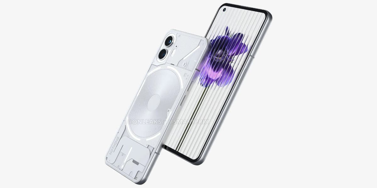
In case you missed it, the leaked renders of Nothing Phone (2) shared that the phone would come with the same display layout as the Phone (1). And with the screenshot shared by the CEO, it would be safe to say that the upcoming phone will indeed have a design change to some degree.
More About the Nothing OS 2.0
According to the information shared by Hoyss in the interview, the home screen of Nothing OS 2.0 will be the main highlight. In his eyes, the home screen should have “what’s personal to you.” He continues saying that the home screen needs to have “your interests, your information,” and all of it should be available “at a glance.”
From the screenshot shared by Nothing CEO, which is possibly from Nothing Phone (2), it seems Hoyss made that vision come to reality. As you might have noticed, the screenshot shows that the home screen does have everything. You have everything from the clock to the weather info to the date and apps.

Moreover, it appears that Nothing OS 2.0 will offer a great level of customization. Wondering how we can tell that? Well, the screenshot shared by Carl Pei and Hoyss is similar but not the same. Both have a unique touch, indicating that users can customize their home screen on Nothing Phone (2) according to their liking.
On that note, Nothing OS 2.0 will also be available for Nothing Phone (1). That means you will not have to purchase the new phone just to experience what the brand-new Android skin has to offer.


