Over the past few years, Android’s visual appearance has undergone significant transformations. Alongside these changes, the brand identity of Android has also evolved. Over time, we have seen various adjustments to Android’s logo and brand. However, the bugdroid has consistently remained an essential element of Android’s identity. The most recent alteration took place in 2019. It featured only the bugdroid’s head and a slightly updated font.
Android has typically received logo updates every few years. The question remains as to whether Google would stick with the current design. However, that is not the case. Google is once again embarking on a redesign of Android’s brand. This time, it appears to be a more radical departure from what we’ve seen previously.
Changes to Expect from the New Android Logo Design 
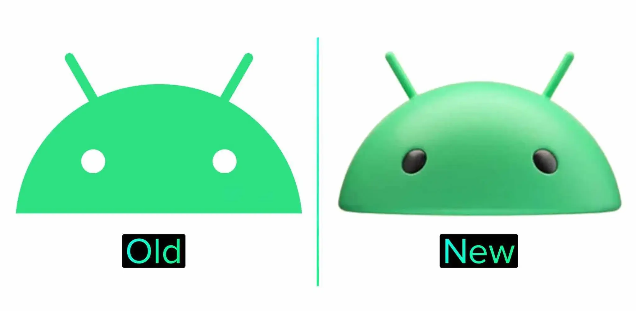
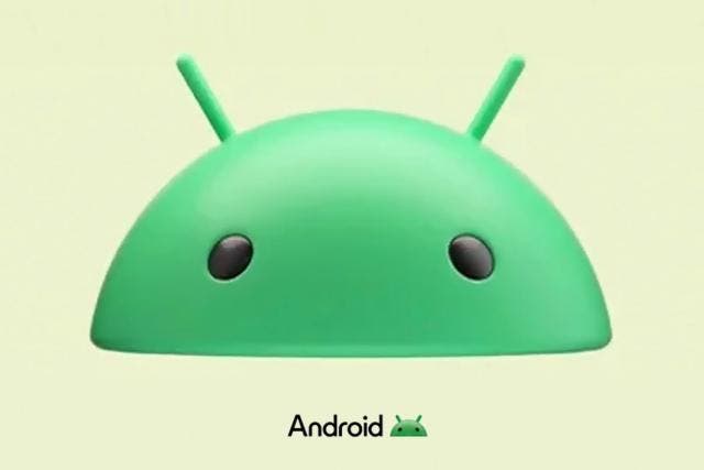
Android is set to receive a fresh logo designed to bring the brand into the 2020s, as reported by 9to5Google. While the iconic bugdroid head will remain, it has undergone a significant transformation. Instead of a flat and reduced shape, the bugdroid now has a 3D appearance with added shadows and light reflections. Although it retains similarities to the current robot head, the new effects make it stand out in a more striking manner. This updated logo aims to give Android a modern and visually appealing look.
Another notable change in the Android logo redesign is the typography. Since 2008, Android has used a lowercase logo. However, the new logo introduces a departure from this convention by featuring a capital “A.” The change may be a minor one, but it brings a fresh visual element to the logo. Additionally, although the font appears to have undergone slight modifications, the most striking and immediately noticeable alteration is the introduction of the capital “A.”
Google Has Been Advertising the New Android Logo for Some Time Now
Google has been gradually introducing the new 3D droid logo since CES 2023. Initially, it was introduced alongside with the previous Android typography. The logo made another appearance during I/O 2023. Recently, it was featured in an advertisement for Android and Google apps on Samsung’s Galaxy S23 Ultra and Flip 4 devices. Google confirmed the brand identity change with the following statement provided to 9to5Google:
We’re showcasing some elements of our new brand identity on various surfaces, including our CES booth from earlier this year and other campaign materials like digital & banner ads. We’ll have more to share in the coming months.
Will the New Android Logo Have Any Impact on User Experience? 
The fact is that people have different tastes and preferences and there is nothing anyone can do about it. The Android logo has remained unchanged for some years now. Barely do you come across anyone complaining about the design. However, slight changes can go the long way to make great impacts. Android is always evolving with new features, animations and looks.
The introduction of the new logo will usher users into a whole new world. Booting to a new Android logo gives you the feeling of a whole new Android experience. Therefore, the changes may be minor, but it is a necessary change for the modern world of technology.


