The Google Play Store is undoubtedly the biggest app listing market in the world. Since launching in March 2012, the platform has grown quickly with new apps coming in each day. As the world’s most popular app download platform, Google works tirelessly to make sure that the platform serves its purpose the best way possible. The company has added several security features and enhancements for better user experience. Speaking of which, Google has just added another feature to help users in navigating the Play Store easier.
Google is Adding a Bottom Bar to the Play Store 
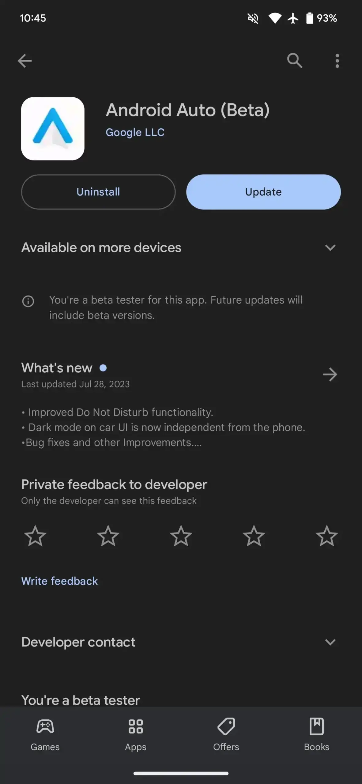
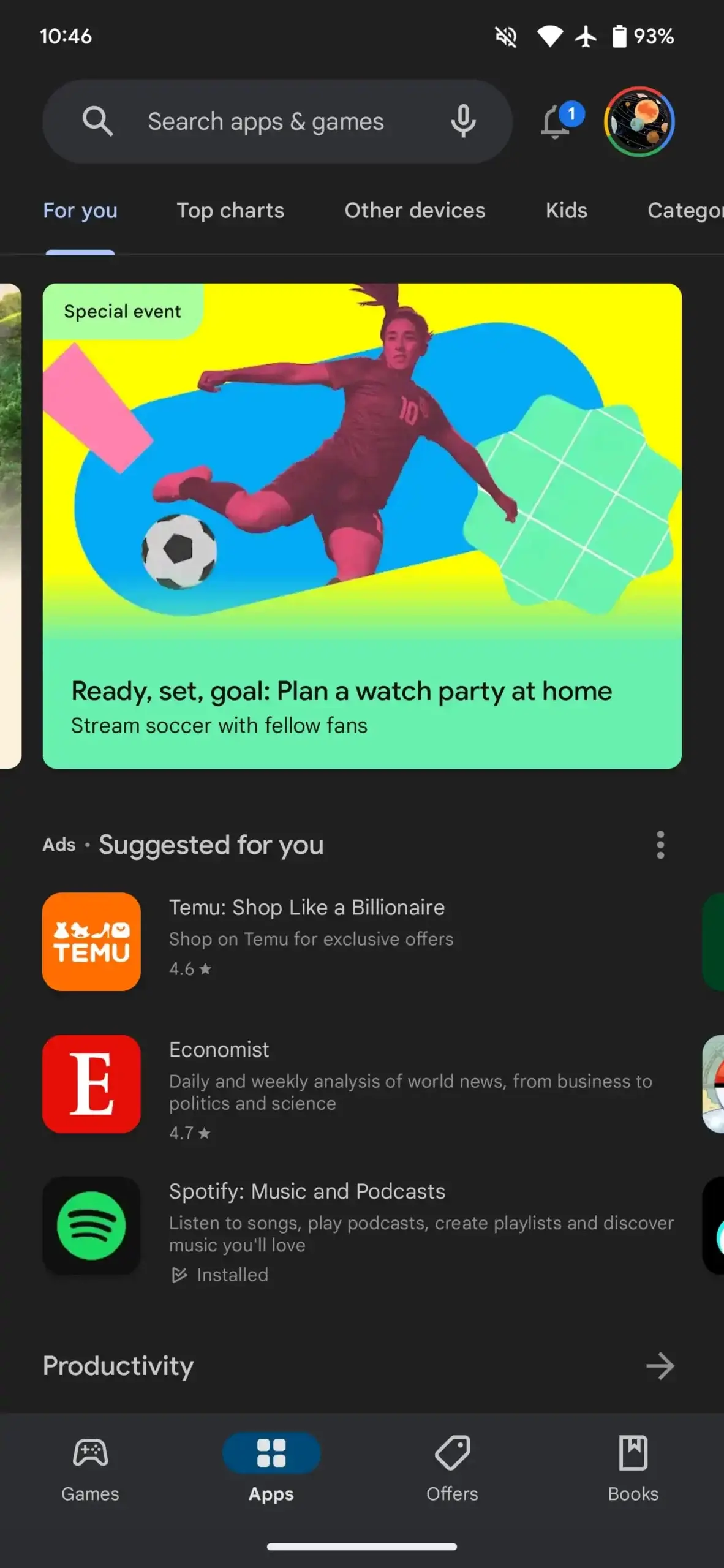
Google is trying out an interesting change to the Play Store on Android. They are adding a bar at the bottom that stays visible most of the time. Right now, the bottom bar with four tabs in Google Play disappears when you leave the main feeds like Games, Apps, Offers, and Books, along with their top tabs. However, they are trying out a new change where this bar will stay visible when you open an app listing (not a book listing). This persistent bottom bar will only appear when you don’t have any active tab selected. Tapping on a section takes you there instantly, and you can return to the listing using a back gesture.
The bottom bar that stays visible all the time does not show up in search results, Manage apps & device, or Pending downloads. The change provides a seamless experience when navigating through the App or Games main feed. However, opening a listing from search or the updates list is not as seamless.
How Useful is the Bottom Bar in the Google Play Store? 
This change seems to be aimed at helping users navigate the Play Store more efficiently. We noticed this server-side change on one of our devices a few weeks ago. This change would be better if the persistent bottom bar appears everywhere instead of just on app pages. Currently, the semi-persistent nature of the bar feels somewhat flawed, almost like it’s a bug. Last year, Gmail implemented a similar (but more consistent) approach.


