Oppo Ditches Iconic Green Logo Color for Minimalist Black and White
oppoThursday, 03 August 2023 at 05:44

The Chinese smartphone manufacturer Oppo has quietly announced a change to its iconic green logo color. The company has decided to ditch the green accents in favor of black accents, as noted by online users in China who spotted the changes in profile images on Weibo.
While many fans expressed their disappointment at the change, Oppo has assured them that green remains an important component of its brand. The company plans to use the color in "interactive visual designs: To enrich every scene where the brand meets the users." However, the logo itself will gradually reduce the use of color and will appear in a monochrome form.
Oppo's Iconic Gareen Logo Replaced by Minimalist Black and White

Oppo China homepage: Before
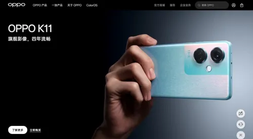
This move away from color is already visible on the brands's website. The green squircle has been removed and the pages have undergone a redesign. The new design features a black and white color scheme, with the Oppo logo appearing in a minimalist monochrome form.

Oppo China homepage: After
This change marks a move from Oppo's previous marketing communication strategy. It had gradually moved away from the green logo color. The company has been using white letters that are sometimes adapted to different visual elements. Such as the purple variant of the Reno10 Pro, which features violet Oppo letters on the box. Similarly, the logo is silver on the Find X6 Pro.
The move to a black and white color scheme is in line with the current trend towards minimalist design in the tech industry. Companies such as Apple and Google have also embraced this trend in recent years. With both companies adopting a minimalist approach to their branding and product design.
Overall, Oppo's decision to ditch its iconic green logo color in favor of a minimalist black and white color scheme is a bold move that reflects the current trend towards simplicity and minimalism in the tech industry. While some fans may not like it, it remains to see whether the move will pay off for the company. Especially in terms of brand recognition and customer loyalty.
Popular News
Latest News
Loading


