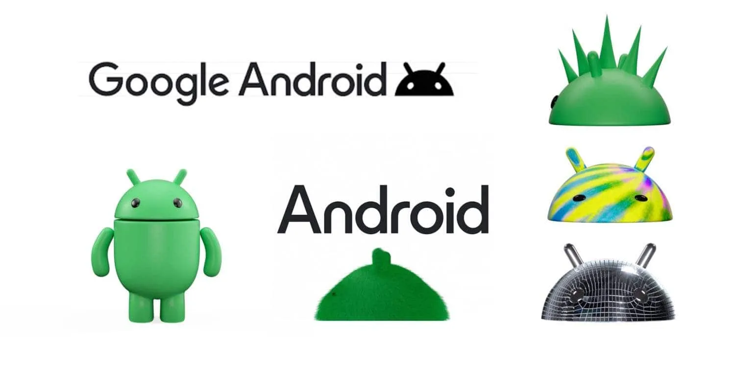
Google has officially unveiled a new 3D logo for Android, along with a refreshed wordmark and brand identity. The company says the updated branding is designed to "help connect Android to Google" and make it more visually appealing and adaptable.
Google Unveils New 3D Android Logo: A Fresh Look for the Brand
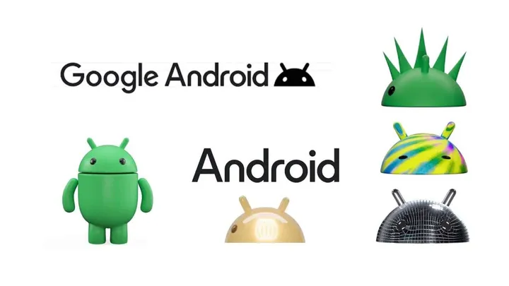
The new Android logo features a capital "A" in a rounded font that is more closely aligned with Google's own branding. The lowercase "a" was dropped from the logo in order to give it more weight and prominence when placed next to Google's logo. They also slightly darkened the green color of the logo.
"Each time we overhaul our branding, we evaluate not only changing needs, but also future goals. We know people today want more choice and autonomy, and we want our brand to be reflective of Android: something that gives people the freedom to create on their terms. As an open platform, it’s important that both our technology and brand are an invitation for people to create, connect and do more with Google on Android devices".
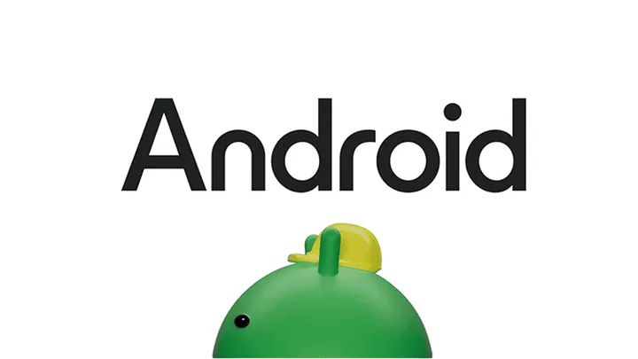
They updated the Android robot, which has been a part of the logo since 2009, to a 3D version. The bugdroid now has more dimension and character, and can be depicted with different materials, colors, and even accessories. Google states that they designed the 3D bugdroid to be "a versatile and reliable companion across channels, platforms, and contexts".
So, the updated Android logo and brand identity will begin appearing on Android devices and in other places starting this year. Also, Google says the new branding is part of its ongoing efforts to "make Android more accessible and inclusive for everyone."
Here are some of the key changes to the new Android logo and brand identity:
- They have capitalized the "a" in the logo.
- They have slightly darkened the green color of the logo.
- They updated the Android robot to a 3D version with more dimension and character.
- They designed the new logo and brand identity to be more visually appealing and adaptable.
Why did Google update the Android logo and brand identity?
Google says the updated branding will "help connect Android to Google" and make it more visually appealing and adaptable. The company also says the new logo is part of its ongoing efforts to "make Android more accessible and inclusive for everyone."
What People think of the new Android logo and brand identity?
People have had mixed reactions to the new Android logo and brand identity. Some people have praised the new look, while others have criticized it for being too different from the previous logo. Ultimately, it is up to each individual to decide whether they like the new branding or not.
What are the benefits of the new Android logo and brand identity?
The new logo and brand identity have a number of potential benefits, including:
- It makes Android more visually appealing and recognizable.
- It makes Android more closely aligned with Google's own branding.
- It makes Android more adaptable to different contexts and platforms.
- It makes Android more accessible and inclusive for everyone.
What are the drawbacks of the new Android logo and brand identity?
The new Android logo and brand identity also have a few potential drawbacks, including:
- It is a significant departure from the previous logo, which some people may not like.
- It may take some time for people to get used to the new look.
- Google has not made it clear how it will implement the new branding across all its products and services.
Overall, the new Android logo and brand identity are a significant change, but they have the potential to make Android more visually appealing, adaptable, and inclusive. Only time will tell how users will receive the new branding.
Loading
