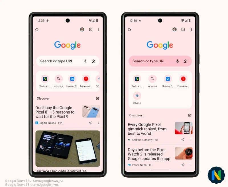
Chrome Canary’s latest update offers users a sneak peek into the potential visual changes coming to the Google Chrome browser. One notable change is the revamped appearance of the new tab page, a popular feature among Chrome users.
The new tab page has undergone a complete makeover, showcasing a fresh and updated look in line with the Material You design philosophy. This design philosophy, championed by various North American tech products, aims to create cohesive and visually appealing user experiences. The new tab page now features a larger Google search bar with rounded corners and displays information about the user’s recently visited pages.
Revamped Visuals: Google Chrome’s Android App Gets a Makeover

Interestingly, Google is taking its implementation of the Material You design a step further by introducing a new look to its Android app. The confirmation came directly from the company itself through its Telegram channel. The rollout of this new design will occur gradually and in phases, starting with the Canary test version.
If you’re eager to try out the new design, you can already do so by updating to the Canary version. Once installed, simply open a new tab to behold the refreshed page and explore its additional information.
Upon observation of the accompanying images, it becomes evident that the “New Tab” page has undergone significant changes. The visual elements are more visually appealing, with the Google search bar taking up more screen real estate.
Additionally, the background color of the page now harmonizes with the user’s smartphone theme. Adapting to the predominant colors chosen by the user. This introduces dynamic themes to the Chrome browser, allowing the page to seamlessly blend with the user’s preferred aesthetics. For instance, if the smartphone has a dark theme or dark mode enabled, the page background will adopt a more subdued tone, and vice versa.
It’s important to note that the new design is currently in the testing phase and is available exclusively in the Chrome Canary version, which can be downloaded from the Google Play Store for Android users. However, it is highly likely that this fresh look will eventually be implemented in the standard version of the browser. Enhancing the browsing experience for all users.


