Google Workspace has introduced a significant improvement to the Drive app for Android, particularly beneficial for users with larger screens. This update introduces a new two-page layout for viewing PDF files, enhancing the reading experience and taking full advantage of the available screen real estate. In this article, we will delve into the details of this enhancement and its impact on Android tablet and foldable device users, as well as discuss the broader context of Google Drive updates designed for tablet users.
Two-Page PDF Viewing Mode for Google Drive 
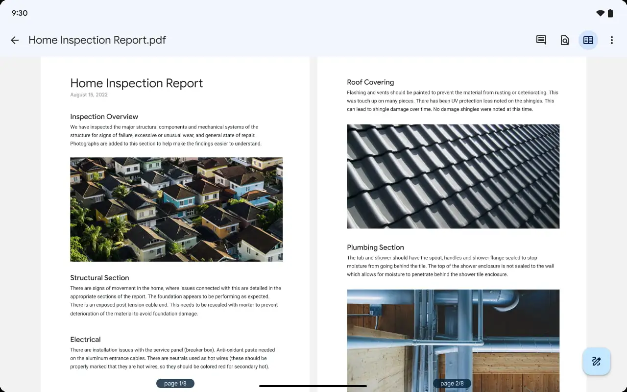
Google Workspace’s recent large screen improvement adds a two-page layout to Drive for Android when you’re viewing PDF files. In addition to the single-page view, a new “two-page width view” has been introduced for scrolling through PDFs. This feature can be activated by clicking a button placed between the search bar and the three-dot overflow menu. Google has designed this view to mimic the experience of reading a book. It will offer a more enjoyable viewing experience on larger Android screens. This is because most tablets have similar size to a standard sheet of paper.
This feature is exclusively available on Android tablets and foldable devices. It is accessible to all Google Workspace users as well as individuals with personal Google Accounts. Google Drive introduced a handy feature earlier this year that allows users to draw on and highlight PDFs, particularly useful on tablet devices. The new two-page PDF view in Google Drive is part of a series of updates designed for tablet users. These updates include multi-instance support, a navigation rail, and larger widgets optimized for tablets’ extra screen space.
Conclusion 
In conclusion, the latest enhancement to Google Drive on Android devices, offering a two-page layout for PDF viewing, represents yet another step toward optimizing the productivity and user experience of Google Workspace. By leveraging the larger screens of tablets and foldable devices, Google aims to provide a more intuitive and enjoyable reading experience. This update, along with previous improvements, demonstrates Google’s commitment to enhancing its services for tablet users. The company is ensuring they have a more efficient and comfortable work environment within the Google Workspace ecosystem.


