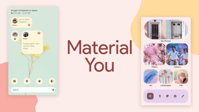
In 2021, Google ushered in a new era of design with the introduction of Material You, replacing the iconic Material Design. As the year 2023 draws to a close, it’s the perfect time to reflect on the transformative impact Material You has had on various applications, services, and facets of the Android ecosystem. Over the past 12 months, Material You has not only brought a fresh and minimalist aesthetic but has also significantly enhanced the user experience across the Google landscape.
The Transformative Impact of Google’s Material You: A Year in Review
The Material You Revolution:
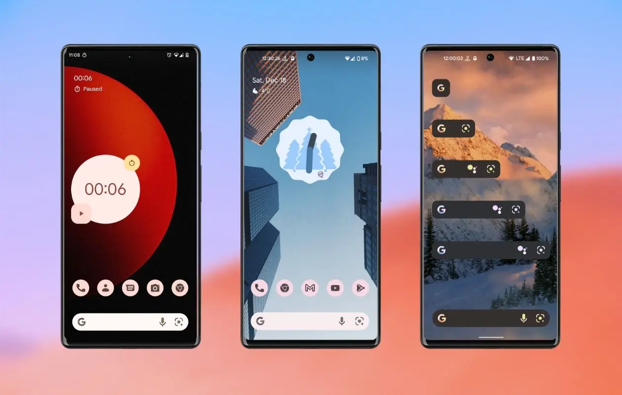
Since its inception alongside Android 12, Material You has seamlessly integrated into numerous applications, services, and elements of the Android operating system. This revolutionary design language has redefined the visual identity of Google’s ecosystem, aligning it with contemporary design trends. As we traverse through the noteworthy locations that have embraced Material You, it becomes evident that Android is now a more aesthetically pleasing and cohesive environment.
Material You Unveiled:
At the forefront of tracking Google’s ecosystem developments, Xataka Android has been a vigilant observer of the Material You evolution throughout the year. From the introduction of the design language in January to its widespread adoption across various applications, the journey has been both exciting and transformative.
Key Redesigns:
The journey began in January when the app for locating lost phones embraced Material You, accompanied by the introduction of a dark mode. This marked the initiation of a series of redesigns that would follow throughout the year. Notable applications such as Google Calendar underwent significant changes, introducing a new way to share events and updating widget designs to align with Material You aesthetics. These widget enhancements not only enhanced the visual appeal but also contributed to improved functionality on users’ desktops.
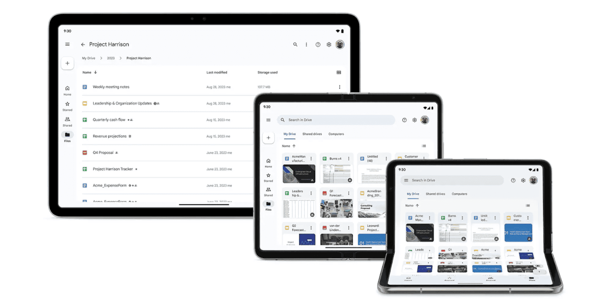
Google Drive, the tech giant’s cloud service, also underwent subtle yet impactful changes throughout 2023. Small tweaks were implemented to update the aesthetics to Material 3, particularly in the web and Android tablet versions. However, the year wasn’t without controversy, as Google Drive made headlines for a ruling that led to the deletion of user files.
October witnessed the most significant change in the form of the Google Time redesign, reaching users after a prior release on Pixel devices. This monumental update breathed new life into the user interface, making it not just an aesthetic improvement but a necessary evolution. Notably, the beloved frog mascot remains a charming constant in the redesigned Google Time interface.
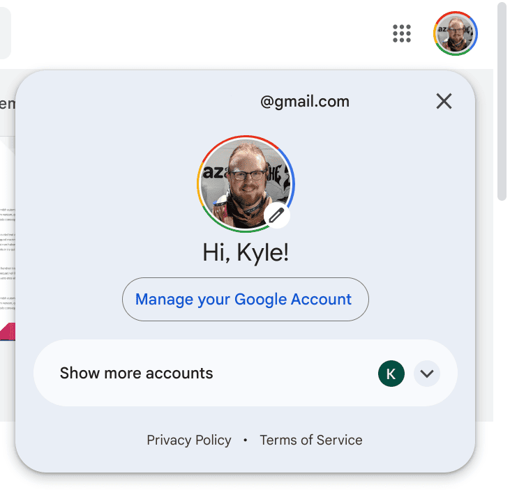
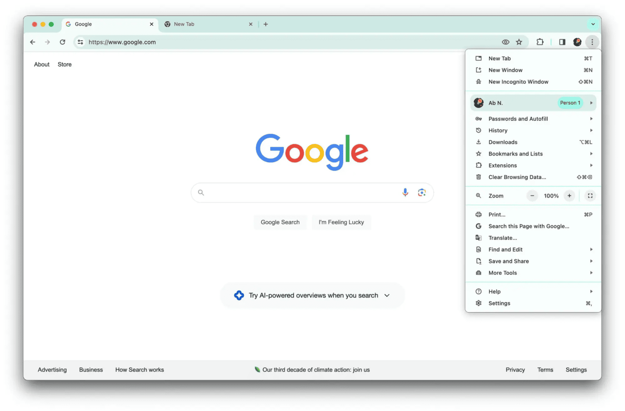
Beyond these applications, the account switcher, present in Gmail, Drive, Maps, and the Play Store, seamlessly incorporated Material You design elements. Meanwhile, Google Chrome, the ubiquitous browser, underwent a complete redesign on computers. On mobile devices, the home screen now aligns with the Dynamic Color (accent color) set on Android, ensuring consistency throughout the operating system.
Adventures of Material You:
Material You has been on a journey of continuous evolution, with the most noteworthy adventure being Google’s Weather application. This weather-focused app experienced a significant overhaul, aligning its design with the principles of Material You. The account switcher, a ubiquitous feature in various Google apps, has also been redesigned to maintain harmony with the overarching design language.
Google Chrome, as the flagship browser, has not been left untouched. The complete redesign on computers and the incorporation of Dynamic Color on mobile devices contribute to a more cohesive and visually pleasing browsing experience. The consistent integration of Material You across these diverse applications and services has undoubtedly elevated the overall aesthetic appeal of Android and Google’s suite of offerings.
Looking Ahead:
As we wrap up the year, Material You continues to expand its influence. The design language has not only enhanced the visual coherence of Android but has also left an indelible mark on the services offered by the search giant. With each redesign, Material You has proven to be a catalyst for positive change, ushering in a new era of aesthetics and user experience.
As we anticipate what the future holds, it is plausible that Material You will continue to evolve, potentially unveiling the next step in its design language. Undoubtedly, the transformative impact of Material You on Android and Google’s services signifies a commitment to innovation and user-centric design. Making the digital experience more delightful for millions around the globe.
Material You: Beyond Aesthetics, Lies a Symphony of Features
Material You, Google’s design language introduced in 2021, is more than just a pretty face. It’s a philosophy, a way of thinking about how users interact with technology. But what are the key features that make it tick? Let’s dive into the essence of Material You:
1. Dynamic Color:
Imagine your phone’s interface reflecting the hues of your favorite sunset or the calming greens of a nature walk. That’s the magic of dynamic color! Material You analyzes your wallpaper and generates a unique color palette that flows throughout the system. Creating a personalized and expressive experience.
2. Bold and Playful Typography:
Gone are the days of sterile, uniform fonts. Material You embraces a bolder, friendlier approach to typography. Rounded letters, contrasting weights, and playful letterforms add personality and visual interest to interfaces, making them feel more approachable and human.
3. Expressive Shapes and Layers:
Sharp edges are out, soft curves are in. Material You emphasizes gentle shapes and layered elements, creating a sense of depth and dimension. Buttons morph from flat squares to inviting ovals. While cards float above the background with subtle shadows, enhancing user experience and visual appeal.
4. Motion with Purpose:
Material You isn’t static. It’s alive! Subtle animations bring interfaces to life, guiding users’ attention and providing feedback on their actions. Buttons pulse when pressed, elements morph as they’re selected. And transitions flow smoothly between screens, creating a delightful and intuitive experience.
5. Accessibility at its Core:
Material You isn’t just about flashy visuals. It’s designed with everyone in mind. High contrast ratios, clear typography, and thoughtful layouts ensure that everyone can access and enjoy the beauty and functionality of Material You.
Beyond the Features:
These are just the building blocks of Material You. What truly sets it apart is its focus on personalization and expression. It gives users the power to shape their digital experience. Making technology feel less like a tool and more like an extension of themselves. So, the next time you pick up your phone or open a Google app, take a moment to appreciate the thoughtful design behind it. Material You is more than just a trend; it’s a glimpse into the future of how we interact with technology.

