In late 2023, Xiaomi unveiled a significant development for its high-end smartphone market in China: the Xiaomi 14 and 14 Pro. These devices introduced a brand new operating system, HyperOS, marking a pivotal shift from the company’s established MIUI interface. HyperOS boasts increased power and versatility, extending its reach beyond smartphones and tablets to encompass wearables like the Xiaomi SU7 smartwatch and potentially even in-car entertainment systems.
Unveiling HyperOS: A Powerful Evolution with Room for User Customization
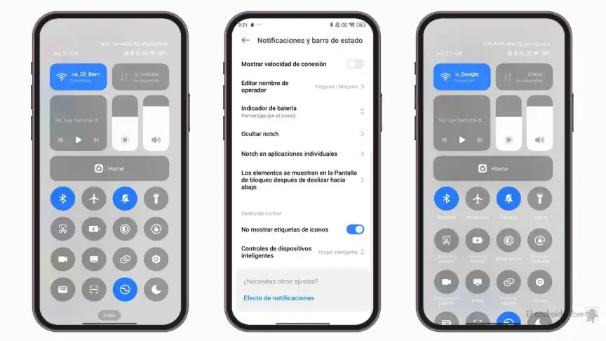
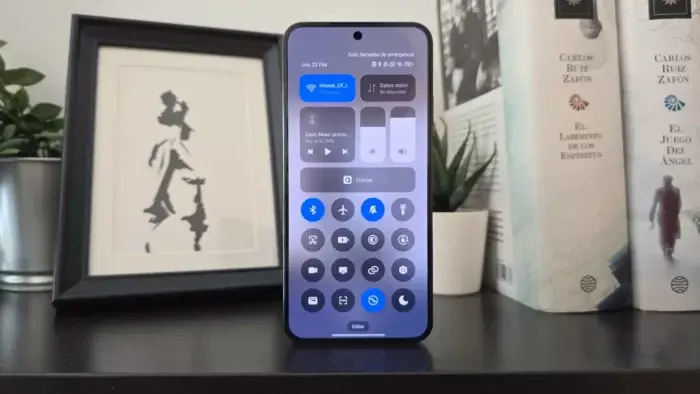
However, with this innovative interface comes a design decision by Xiaomi that has sparked some debate among users. The notification area, typically featuring shortcut buttons for Wi-Fi, Bluetooth, airplane mode, and other essential settings, has undergone a transformation. In HyperOS’ default configuration, these buttons lack text labels, potentially causing confusion for users unfamiliar with their function.
While easily remedied through the settings menu, this omission could deter potential buyers apprehensive about an unfamiliar interface. Notably, the ability to hide shortcut labels isn’t the issue itself – it’s the choice to have them hidden by default.
Activating Shortcut Text Labels in HyperOS

For those seeking to activate the text labels for each shortcut button, the process is straightforward. Navigate to the application drawer, locate the Settings app, and delve into the “Notifications and status bar” section. Here, you’ll find the option labeled “Don’t show icon labels” – likely activated by default. Simply deactivate this option to restore the text labels.
As illustrated in the provided image, enabling the labels comes with a slight trade-off. With all labels displayed, the notification area might require scrolling to view all buttons. However, this issue can be addressed by customizing the notification area to include only the most frequently used shortcuts. This way, you can retain the valuable text labels without sacrificing screen real estate.
A User-Centric Approach to Interface Design
While HyperOS offers a fresh and powerful interface, the default lack of text labels on shortcut buttons highlights the importance of user-centric design principles. A well-designed interface should be intuitive and approachable for users of all technical backgrounds. While offering customization is valuable, default settings should prioritize clarity and ease of use.
Xiaomi‘s decision to prioritize a minimalistic aesthetic over immediate user comprehension serves as a reminder of the delicate balance between innovation and user experience. Moving forward, it would be beneficial for Xiaomi to re-evaluate the default settings in HyperOS, potentially offering a clear toggle between a minimalist view and a more text-heavy notification area, catering to diverse user preferences.
The Future of HyperOS: A Platform for Growth
HyperOS marks a significant step for Xiaomi, signifying its dedication to pushing the boundaries of mobile operating systems. Its ability to adapt to various devices like smartwatches and car entertainment systems suggests a future-oriented approach, paving the way for a more interconnected ecosystem.
However, as HyperOS continues to evolve, user feedback and a commitment to intuitive design should remain paramount. By prioritizing user experience through clear interfaces and customizable options, Xiaomi can solidify HyperOS’ position as a powerful and user-friendly platform for the future.


I did not know of this option!
I actually turned off this iOS control centre because it has no icon label.
Now that I know of this option, I’m back to this iOS control centre.
Thanks for the great info!