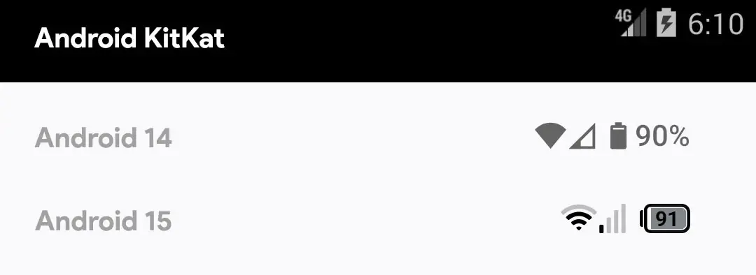
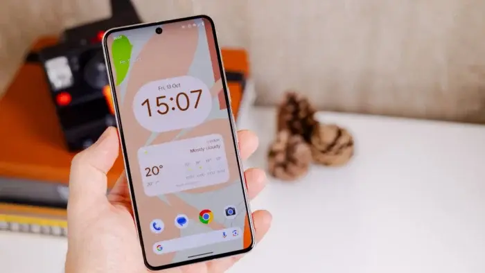
Android’s status bar, the information hub at the top of the screen, might be getting a significant visual overhaul in the upcoming Android 15 update. This redesign primarily focuses on the status icons, including those for battery, Wi-Fi, and cellular signal strength.
A Potential Status Bar Icon Revamp in Android 15

A Departure from Minimalism
Since the introduction of Material Design in Android 5.0 Lollipop, the status icons have adhered to a flat, minimalist aesthetic. While this approach aimed for a clean and modern look, it came at the cost of functionality. For instance, displaying the battery percentage within the icon itself became impossible. This change frustrated many users who preferred the earlier, more informative icon designs.
Enter Segmented Icons and Internal Battery Percentage
Android 15 appears to be addressing this concern by potentially adopting a new icon style. Based on findings in the Android 15 Developer Preview 2, these icons may transition from a flat design to one utilizing segmented bars. This approach, reminiscent of pre-Material Design eras or even iOS, offers a clearer visual representation of signal strength.
Furthermore, the battery icon itself is undergoing a potential transformation. The new design is envisioned to be horizontal and rounded, with the crucial addition of displaying the battery percentage directly within the icon. This functionality, previously missing in stock Android, would greatly enhance user experience by providing immediate access to this critical information.
Impact on Custom UI Layers
It’s important to note that this redesign might primarily affect devices running stock Android or with minimal UI customizations. Manufacturers like Samsung, Xiaomi, and OnePlus often employ custom user interfaces (UIs) that modify the status bar icons. These UI layers typically already offer functionalities like displaying the battery percentage within the icon. And they may not adopt the exact design changes that are in testing in Android 15.
The Road Ahead
While these potential icon changes are currently hidden within the developer preview, their presence suggests Google is exploring a new direction for the status bar. It remains to see whether this design makes it into the final release of Android 15 remains. However, this development signifies Google’s focus on improving user experience by potentially incorporating functionalities and aesthetics that have been user-requested for some time.


