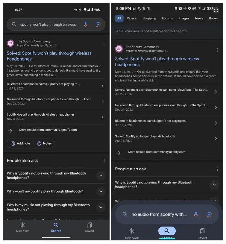
Google’s developers are constantly refining the company‘s applications, introducing both new features and visual updates. One recent design change being tested involves the Google App’s bottom bar. This update incorporates elements from Material Design 3, Google’s current design language, and integrates the search bar directly into the bar.
Google App Testing New Design with Material You Elements and Integrated Search Bar

A More Cohesive Look with Material You
The new design, currently in limited testing with Android users, utilizes Material 3’s design principles. The bottom navigation bar features pill-shaped indicators to signify the active tab, aligning with other redesigned Google apps. This creates a more unified aesthetic across the Google ecosystem.
Enhanced Search Experience
The most striking visual change involves the search bar. Currently located at the top of the app, the new design integrates it into the bottom bar. While this might reduce some result screen real estate, it could potentially improve search accessibility and user experience by placing the search function in a more prominent and easily reachable location.
Improved Search Refinement
Complementing the integrated search bar, the redesign introduces readily available filters at the top of the screen. These filters should allow users to refine their searches quickly and efficiently, leading to more precise results.
Modernized Aesthetics
The current iteration utilizes a default blue color instead of dynamic theming. While the final color scheme might change, this initial approach suggests a move towards a cleaner and potentially more modern look for the Google App.
Availability Still Unknown
While the testing phase suggests Google is actively considering this design overhaul, there’s no official information regarding a wider rollout to all users. We can expect further refinements and potential adjustments based on user feedback during the testing period.


