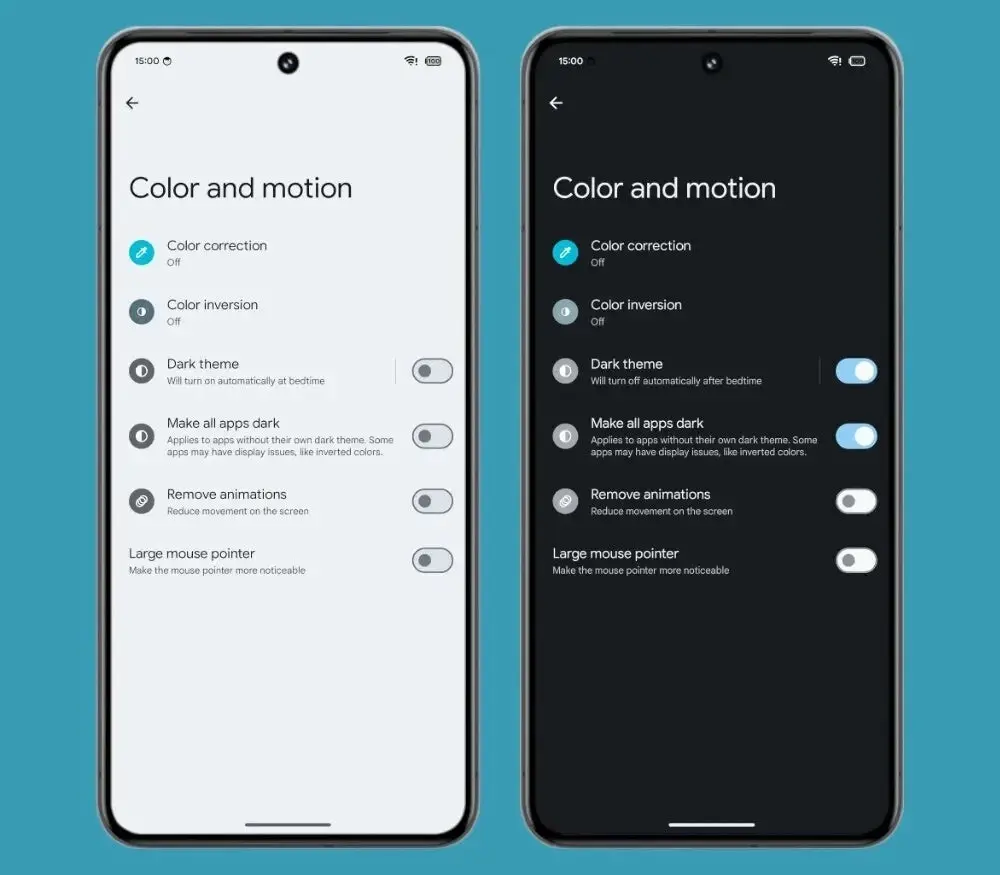
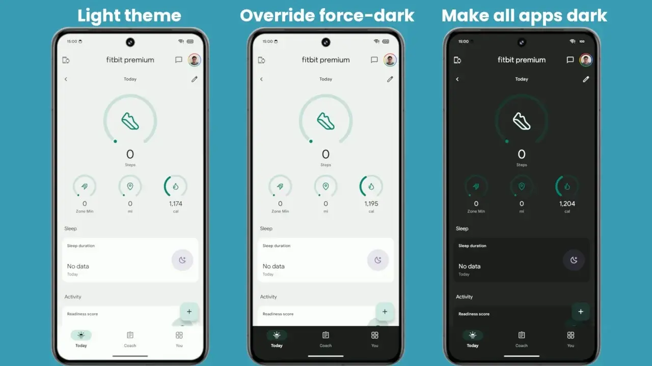
For users who favor the eye-pleasing aesthetics and potential battery life improvements of dark mode, encountering an app stubbornly clinging to a blinding white interface can be jarring. Android 15 seeks to remedy this frustration with the introduction of a novel accessibility setting: “Make all apps dark”.
Embracing the Dark Side: Android 15 Ushers in Universal Dark Mode

This isn’t Google’s first foray into enforcing dark mode. Android 10 introduced a developer option for forceful application darkening, but its efficacy wasn’t universal. The new approach in Android 15, designed with accessibility in mind rather than developer tinkering, promises to cast a wider shadow, encompassing a greater number of apps.
The Evolution of Dark Mode on Android
Dark mode’s ascent on Android has been gradual, first appearing in Android 10 and receiving refinements with each subsequent update. The operating system itself has seamlessly adapted to dark themes for years. But app-specific support has remained contingent on developer implementation. Unfortunately, some apps stubbornly resist the dark side, causing consternation for dark mode enthusiasts.
Android 15 aims to alleviate this by integrating a new accessibility option within the “Colors and motion” section of the accessibility settings. This aptly named setting, “Make all apps dark,” precisely targets this pain point: forcing dark mode on all applications. Even those lacking a native dark theme.
It’s crucial to acknowledge that this is a forced approach. And some apps might exhibit inconsistencies in their appearance as a consequence. Android itself warns of such potential glitches within the setting’s description.

Early Insights: Improved Functionality and Accessibility
Mishaal Rahman, a notable Android developer and enthusiast, has had the opportunity to test this pre-release feature in the latest Android 15 Beta 1.2. His findings suggest that the new setting outperforms the previous developer option. Delivering superior results and broader applicability across a wider range of apps. Additionally, its placement within accessibility settings enhances user accessibility compared to its developer-focused predecessor.
While the “Make all apps dark” setting remains inactive for users in the current Android 15 betas, it’s important to remember that several beta releases typically precede the final rollout. Assuming a smooth development cycle, expect this user-friendly dark mode enforcement to be readily available by the official Android 15 release, likely targeted for the summer months.
Delving Deeper: Nuances and Considerations
The introduction of “Make all apps dark” presents a compelling solution for dark mode devotees. But it’s prudent to delve deeper into some key considerations.
Potential Rendering Issues: As previously mentioned, forcing dark mode can introduce rendering inconsistencies within certain apps. Colors might not invert perfectly, leading to text illegibility or graphical glitches. This is an inherent trade-off when overriding an app’s intended design.
Balancing User Preference with Developer Control: While user preference for a consistent dark mode experience is understandable, it’s also important to acknowledge the creative control app developers hold over their products’ aesthetics. In some instances, a particular visual style might be crucial for maintaining an app’s brand identity or functionality. Forcing dark mode onto such apps could potentially undermine the developer’s vision.
Striving for Harmony: Ideally, a future scenario could emerge where a combination of factors – native app support for dark mode, a refined “Make all apps dark” setting that minimizes rendering issues, and developer control over certain UI elements – could create a harmonious user experience where dark mode preference is seamlessly respected.

The Future of Dark Mode: Beyond Android 15
The introduction of “Make all apps dark” in Android 15 signifies a significant step towards a more unified and user-centric dark mode experience. However, the quest for optimal dark mode implementation doesn’t end here. Here are some potential areas for future exploration:
Collaboration Between Developers and Operating Systems: Imagine a scenario where app developers can provide specific UI elements or configurations optimized for forced dark mode within their apps. This collaborative approach could significantly improve the rendering quality when “Make all apps dark” is enabled.
Advanced Algorithmic Solutions: Continued advancements in machine learning and image processing could pave the way for more sophisticated algorithms that can intelligently adapt an app’s interface for dark mode while preserving readability and visual coherence.
User Customization Options. Allowing users to adjust the intensity or specific aspects of the forced dark mode implementation could further personalize the experience. This could include controlling the level of contrast or adjusting the darkening of specific UI elements.
The Accessibility Angle: Dark Mode Beyond Visual Comfort
The focus on dark mode has primarily centered on its visual appeal and potential battery life savings. However, Android 15’s “Make all apps dark” setting highlights a lesser-discussed aspect: accessibility.
For users with visual impairments, particularly those with conditions like light sensitivity or cataracts, bright white interfaces can be incredibly straining. Dark mode offers a reprieve, reducing glare and improving screen readability. The ability to enforce dark mode across all apps ensures a more consistent and comfortable user experience for individuals with these conditions.
Furthermore, dark mode can benefit users with cognitive impairments. The high contrast between light text and dark backgrounds can make it easier for users with dyslexia or ADHD to focus on the content on the screen. By mitigating visual clutter, dark mode can contribute to a more streamlined and less distracting user experience.
The accessibility implications of “Make all apps dark” extend beyond vision-related issues. Users with motor control limitations might find the reduced visual strain associated with dark mode helpful, as it allows them to focus on navigating the app’s interface without undue fatigue.
It’s important to remember that accessibility is not a monolithic concept. User needs vary greatly, and while dark mode can be beneficial for many, it might not be the optimal solution for everyone. Fortunately, Android offers a range of other accessibility features, such as text scaling, color correction, and screen readers, which can be combined with dark mode to create a truly personalized and inclusive user experience.
The Developer Perspective: Balancing Control and User Choice
The introduction of “Make all apps dark” raises questions for app developers. While some developers might welcome the prospect of a wider user base embracing dark mode, others might express concerns about the potential impact on their creative control and the user experience they’ve meticulously crafted.
Maintaining Brand Identity: For some apps, a specific color scheme or visual style might be fundamental to their brand identity. Forcing dark mode onto such apps could potentially clash with the developer’s vision and create a disconnect between the app and its intended brand image.
Ensuring Functionality: Certain apps, particularly those that rely heavily on visual elements like charts or graphs, could encounter functionality issues when subjected to forced dark mode. Colors might become indistinguishable, or key information could be rendered illegible. Developers might require some level of control over how forced dark mode is implemented within their apps to ensure core functionalities remain intact.
Finding Common Ground: Open communication channels between developers and operating system creators like Google are crucial. By working together, they can potentially develop solutions that respect user preference for dark mode. While allowing developers to retain some control over the visual aspects of their apps. This could involve providing developers with the ability to define specific UI elements that are exempt from forced dark mode or offering granular control over the level of darkness applied to different parts of the interface.
Conclusion: A Symphony of Preferences
The ideal scenario for dark mode would be a harmonious interplay between user preference, developer control, and operating system capabilities. Here’s how this symphony might play out:
- User Choice: Users have the freedom to seamlessly enable dark mode across all apps through a user-friendly accessibility setting like “Make all apps dark.”
- Developer Control: Developers retain the ability to define certain UI elements or functionalities that are exempt from forced dark mode. Ensuring their creative vision and app’s core functionality remain intact.
- Operating System Refinement: The operating system employs advanced algorithms that can intelligently adapt app interfaces for dark mode. While preserving readability, visual coherence, and developer-defined exceptions.
By fostering collaboration and continued innovation, the future of dark mode holds the promise of a truly user-centric experience that caters to diverse preferences and accessibility needs. Users will have greater control over their visual environment, while developers can maintain a degree of creative autonomy. This collaborative approach will pave the way for a more inclusive and visually appealing mobile experience for everyone.


