Google wants to make it super easy to explore and get around, so they're giving Google Maps a big upgrade. They showed off the new design at a special tech event called I/O 2024, and now it's rolling out to more phones.
Google Maps is getting a fresh, new look!
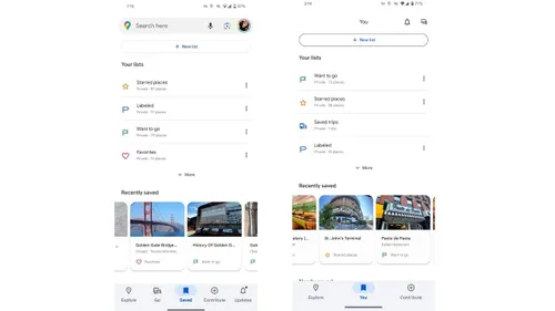
Imagine your room is a total mess, and then you clean it up and organize everything. That's what Google did to Google Maps. It's now cleaner and easier to find what you need. Instead of a bunch of buttons at the bottom, there are just three simple ones. The button to find cool places to go is still there, but the button to get directions is now hanging out with your saved places. You can find your saved spots by tapping the button with your picture on it.
To give the map more space to shine, your messages and news have moved to the top right corner. This makes the map feel bigger and clearer. Google wants you to love exploring the map, so they took away the search bar at the bottom and let the map be the star.
If your phone is pretty new, you might already see the fancy new look. If not, don't worry! Try closing Google Maps and opening it again. The new design might pop up then.
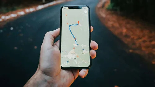
Google Maps is getting better
But that's not all the surprises! Google also changed how you see different places on the map. It's like flipping through a really cool book. These two big changes together make Google Maps feel modern and exciting.
These iterative enhancements highlight Google's dedication to improving the G Maps experience. By simplifying the interface and emphasizing key features, the company aims to boost user satisfaction and efficiency. As the update rolls out, monitoring user feedback and evaluating the long-term effects of these design changes will be insightful.
We're super curious to know what you think about the new G Maps! Do you love it? Is it confusing? Let us know!
Popular News
Latest News
Loading

