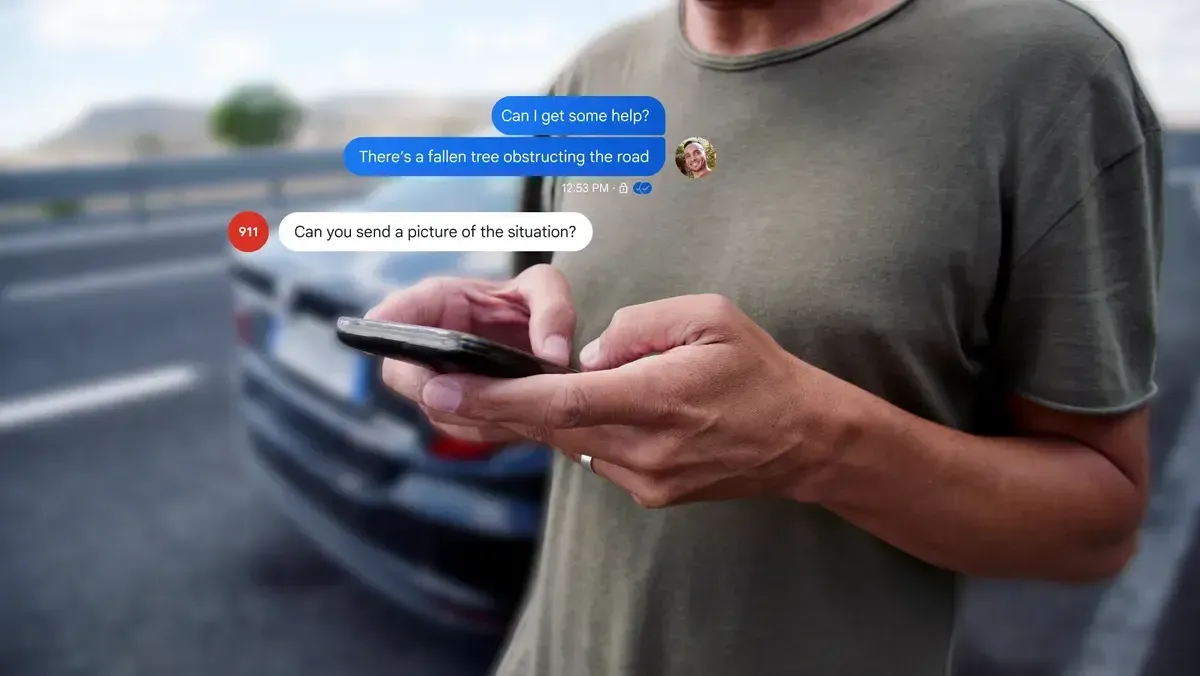
Google is trying out a new design for read receipts in Google Messages. The read receipts are now inside the message bubble. They appear on the right side, inside a circle that is a bit lighter than the message background. For images, the checkmarks are in the bottom-right corner.
Here’s a breakdown of the new read receipts:
Timer: Your message is still being sent.
Single check: Your message has been sent successfully.
Double check: Your message has been delivered.
Color-filled double check: Your message has been read.
Single check: Your message has been sent successfully.
Double check: Your message has been delivered.
Color-filled double check: Your message has been read.
In early 2023, Google Messages had a redesign, and now they are testing another change. Previously, read receipts were under the message, between the time/date and the RCS encryption lock. The new icons replace the old word-based approach.
Google Messages Redesigned Read Receipts
This redesign places the checkmarks in a more visible spot, making it easier to see the status of your messages. Google continues to improve the user experience by making these small but significant changes. For photos, the new design puts the checkmarks in the bottom-right corner, ensuring they don't cover important parts of the image.
Google Messages Old Design vs New Design
By testing these updates, Google aims to make Google Messages more user-friendly and intuitive. The new read receipt design helps users quickly understand the status of their messages at a glance. This is part of Google’s ongoing effort to enhance its messaging app and keep it up-to-date with user needs and preferences.
Explaining the New Google Messages Interface
The read receipts still use checkmarks, but the system is a bit different now:
- Ellipsis: This indicates that the message is currently sending.
- Single check with ring: When the message is successfully sent, it is indicated by a single check with ring.
- Double check with ring: This also indicates a successful delivery of the message.
- Double check solid circle: Now, the sender will see a double check solid circle when the receiver reads the message.
Google's redesign shows read receipts on all previous messages, not just the latest one. This change makes it clear when messages are read. However, it might not be necessary in the big picture.
Loading
