Google Calendar Web Version Finally Gets Dark Mode


Google Calendar

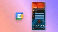
Google has recently launched a major update for its web based Google Calendar app. Marking one of the company’s biggest revamps in recent years. Known for its ongoing commitment to improving user experience, Google has now introduced dark mode and an updated interface that follows the Material Design 3 guidelines. This refresh makes Google Calendar sleeker, more user friendly, and in tune with modern design trends.

Google Calendar’s New Look: Dark Mode and Modern Design Refresh

The update to Google Calendar’s web interface brings a fresh, rounded design, replacing the previously sharp edged elements with smoother, oval forms. This shift is more than just a visual upgrade; it’s designed to create a softer, modern look that enhances user experience. The new interface makes managing schedules and appointments easier on the eyes and more intuitive.

These design changes align with Google’s broader Material Design 3 standards, which aim to create a cleaner and more cohesive look across Google’s entire range of products. Users will notice familiar design elements that echo other Google apps. Providing a smoother transition and a unified experience across Google’s services.

Gizchina News of the week


Easy-to-Use Dark Mode and Customization Options

One of the most exciting additions to Google Calendar’s web version is dark mode support. A feature that many users have eagerly anticipated. Dark mode provides a lower light option, making it ideal for those who prefer darker themes or often work in dim settings. Enabling dark mode is straightforward: go to Settings > Appearance, where you’ll see three choices—Light, Dark, and System Default. This level of flexibility lets users pick a display mode that’s most comfortable for them. Whether they’re in bright or low light environments.

Consistent Design Across Google’s Services

Alongside the Google Calendar update, Google is also applying this new design to its task management tool, Google Tasks, accessible at tasks.google.com. By bringing the same modern look to Google Tasks, Google ensures a consistent, visually pleasing experience when switching between tools for managing schedules and to-do lists.

Gradual Rollout of the Update

This comprehensive update will be rolling out gradually over the next few weeks, reaching Google Calendar users worldwide. Google’s goal with these changes is to offer a more polished, cohesive, and user friendly interface across its web-based and mobile applications.

So, have you tried the new Google Calendar update yet? What are your thoughts on the redesigned interface and dark mode? Share your experience in the comments below!

Disclaimer: We may be compensated by some of the companies whose products we talk about, but our articles and reviews are always our honest opinions. For more details, you can check out our editorial guidelines and learn about how we use affiliate links.

Source/VIA :
Previous Galaxy S25 Ultra May Lag Behind iPhone 16 Pro in Display Technology
This is the most recent story.