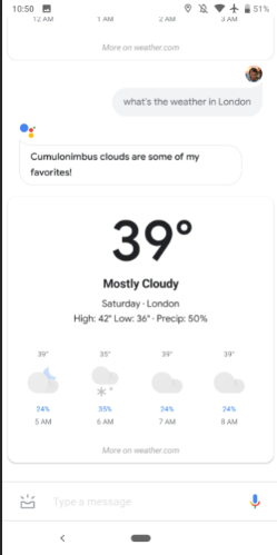
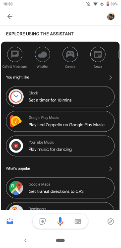
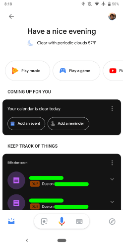
The Outcry for a Wide System Dark Theme has been heard by Google, at least, that’s what recent leaks are pointing out. Recent leaks revealed that Android Q is likely to feature a black color theme for its usual blinding-eyes light color. Today, a new beta of Google Assistant app surfaced, revealing the first signs of a Dark Mode in the Virtual Assistant interface.
Google is way behind the competition in the dark mode game, and we are not only talking about manufacturers and their own theme-overlays but also about the Custom ROM community that managed to build solid Theme offerings for Android over the past years. The claim for a Dark Theme in Android came since the debut of Lollipop when Google dropped the former pitch black Holo Interface in favor of a lighter Material Environment. The giant of searches have been working in a dark theme since Android Marshmallow, but due to some limitations, the option never passed through beta stages.
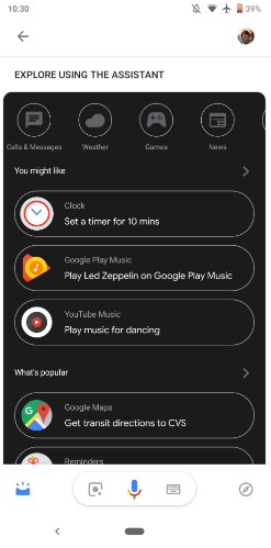
The latest Google Assistant Beta is Google’s latest experiment in dark-moving its applications, and as you might expect it has some issues such as inconsistent coloring and glaring contrasts. The cards, queries list and results are all blacked out, while the rest of the interface is glaringly white. At least, seems that Google is finally decided to hear users that want to have a more gentle-night-experience or that simply want to see an increase in the battery life of smartphones with OLED panels.
If you want to test Google’s Assistant Dark Mode, you’ll need to opt-in the beta program of the app in the Play Store. After you’re successfully enrolled you’ll need to enable it by switching “Night Mode” in Android’s Pie developer options menu to “Always On.”


