The American company continues the work of modernizing its OS. After starting the deployment of new icons for its applications, Microsoft is preparing a new interface for the Windows 10 Start menu.
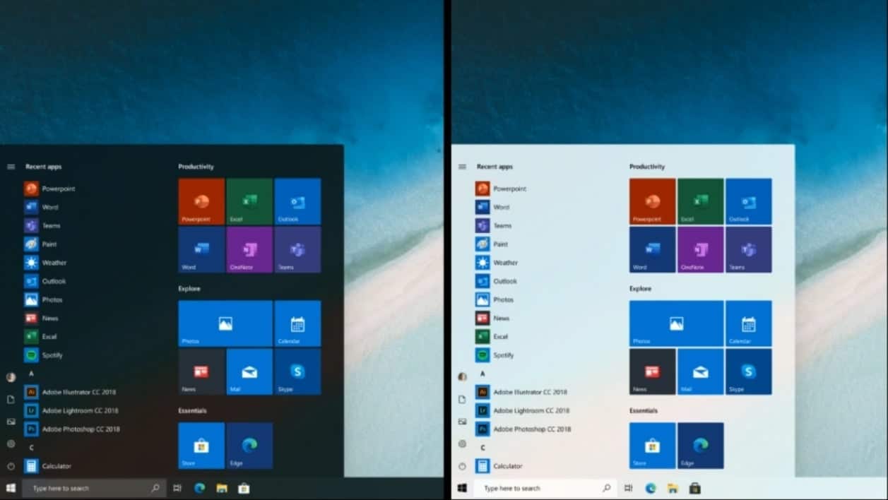
In a video podcast intended for Insiders and broadcast on Mixer, the Windows design team unveiled what the future Windows 10 Start menu will look like.
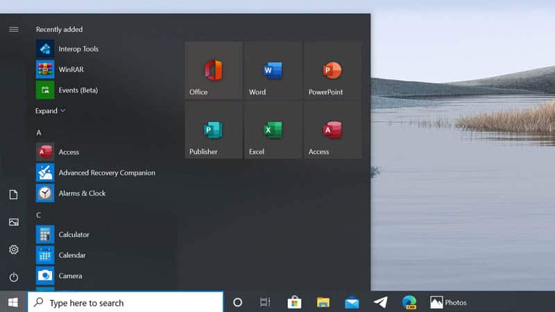
While it was until now structured around dynamic tiles, the Start menu is no exception to the Fluent Design that Microsoft wants to install in the OS and will adopt static tiles, more modern and more sober.
Windows 10: Dynamic tiles still available

The facelift of the Windows 10 Start menu intends to put an end to the variegated tiles and offer a uniform experience, whether the user has configured a dark theme or a light theme.
The menu interface, which also plays on the effects of transparency, will also highlight the new icons of applications whose deployment has started with some users in recent days.
Gizchina News of the week
For the time being, the Windows 10 design team has not given any details regarding the availability of this new interface. They explain that they are still exploring the possibilities and that work on this project is still in progress.

The upcoming arrival of the new interface to the Windows 10 Start menu does not signify the end of dynamic tiles. If Microsoft intends to make them disappear in the future, for lack of interest and follow-up on the part of the developers, the firm explains that users who wish to can continue to use them. Microsoft will decide the final fate of dynamic tiles after the first feedback on the changes made in Windows 10X.
The new Windows 10X Start menu looks very different to the existing menu found in the desktop version of Windows 10. It includes apps you can pin in place and a list of recent documents, and looks like more of a task launcher than what exists right now.


