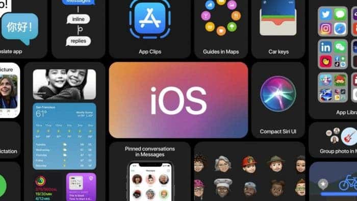
Apple made many changes to its mobile platform interface with the launch of iOS 14 a couple of weeks ago. However, users did not like all of them.
The authoritative resource ZDNet drew attention to the problems with the inconsistent interface changes. The source even compares this phase of iOS 14 development to Windows, where similar problems are observed. The new and old versions of the interface are mixed in the system. You may be using the new interface, but after a couple of clicks you come across the old interface elements.
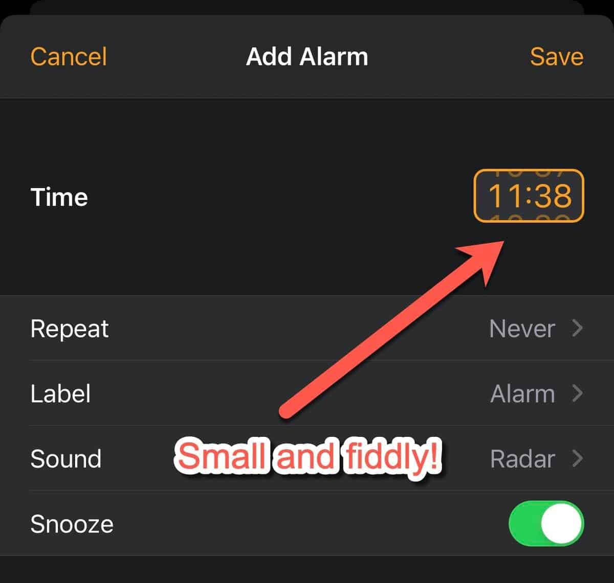
An example is the new time entry system with a small window instead of the old scroll wheels. Of course, the ability to enter the time from the keyboard is convenient; but for this, it is not necessary to make the elements small and inconvenient for touch input.

Another area of confusion between new and old interfaces is seen in the settings app, reminiscent of the situation with the gradual disposal of the Windows Control Panel. As a result, some settings became difficult to find.
For example, the picture-in-picture feature is available in the General settings subsection; while the home screen, brightness setting and wallpaper are just in the main settings menu. The modem mode (Personal Hotspot) also has its own personal line in the main settings; but we can also find it in the “Cellular” section. The organization of the settings pages is also poor. And the more a user installs apps, the more confusing it gets.
Gizchina News of the week
Google makes fun of Apple’s innovations in iOS 14
The main innovation of the final version of iOS 14 launched recently is the revised user interface; which brought such features as widgets for the desktop, pop-up notifications, picture-in-picture mode for watching videos on top of other windows and updating standard applications. For many years, Apple has been slow to implement these useful features that were implemented in the Android OS a decade earlier. Unsurprisingly, this was the reason for the emergence of jokes on the Internet, which Google itself has joined.
For example, a Twitter post from @madebygoogle showed the desktop of the recent Google Pixel 4a with a reminder widget labeled “Realize we’ve had widgets 4ever” and “Tell the world about it”. Recall that widgets have been available since the very first version of Android 1.0, released back in 2008. The Internet community does not lag behind, which ironically reminds of the existence of such functions as multi-window, launching video in a window over applications (picture-in-picture) and pop-up notifications about calls back in 2011-2012.
Wait, we're talking about homescreens now? Here's ours #Pixel4a pic.twitter.com/03jwdIdQUk
— Made By Google (@madebygoogle) September 18, 2020


