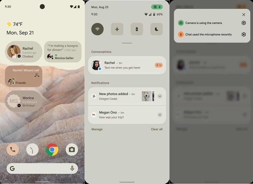
As the year is advancing, we’re getting close to the release of the first Android 12 Developer Preview. That’s crazy to hear that when many companies are still running to bring Android 11 for their devices. But, that’s not Google’s fault and Android needs to keep growing every year. According to recent reports, the new firmware version will bring a major overhaul in terms of design. Back in the last week, the folks at XDA-Developers published a couple of images that depicted major UI changes in the next Android OS, Android 12.
The images leaked came from a document that Google shared with its OEM partners. They are likely mockups designed to showcase Android 12’s enhanced theming capabilities. In the few images obtained by XDA, we were able to get a glimpse of the new notification panel UI, home screen, privacy settings, Google Camera app, and what seems to be a new kind of system widgets. In fact, these images are probably part of a new theming system that will arrive with Android 12. However, it clearly shows the direction that Google is taking with Android.
The new Android 12 will open a road to Material NEXT
According to a new report, Google is internally naming some if notification UI changes as the start of the “road to Material NEXT.” If you recall, the brand unveiled Material Design with Android Lollipop, and then, brought Material Design 2.0 with the Android 9 Pie. Apparently, Material NEXT will mark the next big change in the UI direction. Interestingly, guidelines evolved to encourage companies to adopt their own identities on top of Material Design. Instead of encouraging companies to stick with Android stock, the search giant is asking companies to only respect and innovate with their guidelines.
This is interesting since users can get a different experience in the multitude of Android skins that we have in the market. Although the name is cool, Material NEXT probably will not be the name of the new design guidelines. After all, Google never referred to its Material Theme changes as “Material Design 2.0” externally. We don’t know if Material NEXT changes will encompass more than just notifications.
Gizchina News of the week
Material NEXT, new AOD menu, revamped Quick Settings, and new theming engine
Interestingly, Google is preparing to adjust the layout of the Always On Display and Lock Screen in Android 12. The brand will shift the notification icons for the Always On Display so they are no longer centered in the new layout. The clock view and smart space will be aligned to the top of the display. There may also be new AOD / Lock Screen transitions, but we do not know what they will look like. These transitions may not make way to Android 12 Developer Preview builds as Google will hide these changes using a “Google Experience” overlay.
The UI pattern will finally get Material Design treatment
The brand will also tweak the UI of the pattern lock used for the lock screen. It is also working to integrate Android’s Device Control feature into a dialog on the lock screen, accessible from an “affordance” on the keyguard’s bottom area. The company will also enable additional lock screen options in Android 12, a feature that has been in development since Android 10.

The report also says that Google is testing a change to the Quick Settings panel. In Android 12, the search giant is preparing to shift the QS Tile labels to the side. We expect some backlash to come from this change. Prototyping for this feature began in late December, but the work has been ready earlier this month. When enabled, QS tiles appear in two columns. We don’t know how this will look, but we need to remember that Android 11’s changes to the QS density were controversial.
RRO on the go will boost a new theming engine
Another addition is a default splash screen window. It is either light or dark based on the current DayNight theme setting. This may be part of a broader effort to improve the app launch experience. In order to improve Android’s system-level theming capabilities, Android’s Runtime Resource Overlay (RRO) feature is getting a major upgrade. So far, RROs have been APK packages that need to be installed on the device before they can be activated. However, Android 12 can now generate non-APK on-the-fly. Perhaps, this can even give power to Substratum.


