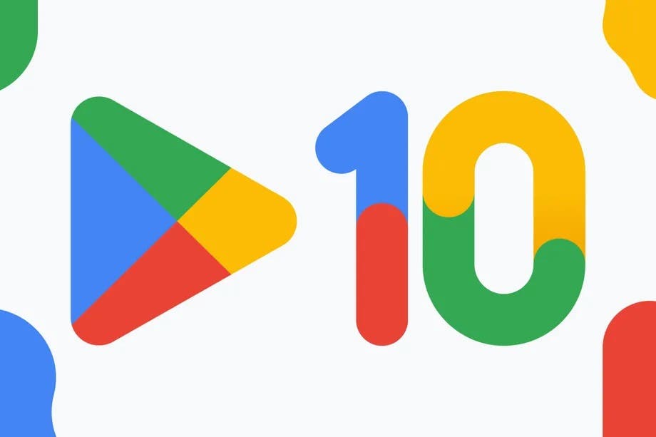
The Google Play Store has got a new logo. The redesign is not particularly radical; but the proportions and colors change a bit in order to ensure greater consistency with what is available in other software products. The edges of the triangle are a little more rounded, the green is darker, the yellow as well. In short, the same colors found in the search engine logo (and, as we said, many other company software, from Maps to Drive through Gmail and Assistant). We had already spotted it in recent weeks, but now the change is official.
Google began distributing the new logo on Play’s 10th birthday. In fact, this anniversary has already passed a few months ago, given that the presentation of the service (a significant improvement compared to the Android Market that we knew up to that moment) dates back to the beginning of March 2012. The company noted that the actual availability of the icon will vary significantly from one market and context to another (e.g. Web version VS Android app).
Gizchina News of the week
Google Play’s new logo is official for its 10th birthday

Compared to 2012, the Play brand has been downsized in a rather important way. Initially Google had launched a number of services (Play Store, Play Music, Play Film and TV, Play Newsstand, Play Books); but to date, in addition to the Store, only Play Books has survived; and it is not impossible to bet that it will not last that long. At this point, in effect, Google uses more of the term “Play” instead of “Play Store”; because it is now impossible to be any misunderstandings.
Google is indicating some more initiatives to celebrate Play’s 10th birthday. In the USA, for example, starting from today the Play Points that users get; through purchases of apps, games and in-app content increase tenfold.


