The Google Phone app for Android has undergone a change. With its updated interface, using it with one hand is considerably more practical. It is just in beta for now, but it will soon be available to the whole public.
Soon, the Google Phone app will receive a nice update. The Mountain View corporation hopes to improve it. Here, the goal is to make it much more manageable with just one hand.
The 90.0.475844574 new version is still only accessible to beta testers. If all goes according to the plans, it should be available to the broader public within the next few weeks, if not days.
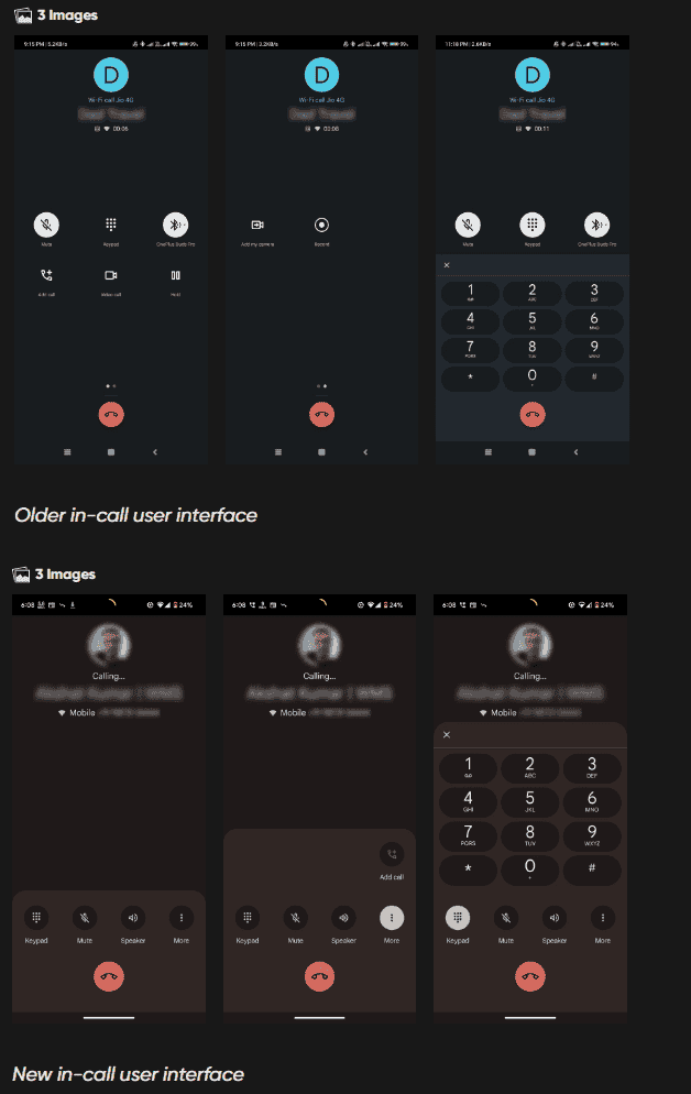
You presently have two rows of icons, or a total of six, when on a call. Less popular features can be available on a separate page. Half of the user interface does not appear when the numeric keypad shows.
The updated version makes several corrections. Now, there is only one row with four icons for the keypad, mute, speaker, and more. The window’s upper portion extends if the user requests more. The keypad, which is in use to replace several icons, does the same thing. When necessary, everything can be seen on the screen.
Gizchina News of the week
For the Phone app, Google is exploring a more user-friendly call interface

But the buttons’ placement has seen the most significant change. They are available near the bottom of the screen, as we can see in the screenshot. Given that they are quite simple to reach with the thumb, this fundamentally changes everything. As a result, using the interface only requires one hand. It is possible to change the sequence of the buttons. Therefore, left-handers won’t have problems.
Although we can do the essentials of this application with one hand, it was challenging to do so at a time when phones are growing larger and larger. Therefore, the interface revamp is appreciated. Google makes incremental improvements to its native Android apps over time, but complete interface redesigns are uncommon, especially for such critical software.


