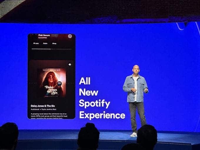
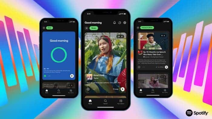
At the Spotify Stream On event yesterday, the company announced many new things. But the main highlight is the new interface of the app. At first glance, it looks exactly like the feed on your Instagram or TikTok app. And according to the company, the new interface will work similarly to those too.
So, the new interface of Spotify will change how the streaming service recommends new music to its users. It will show you music video clips and other visual aspects of the recommended music. And in case you didn’t notice, the previous interface would only show you a standard list of albums.
Ready to See the Spotify App Come Alive?
With the new interface in place, album covers will be at the top of the app’s feed. There can also be an auto-playing music video or podcast right underneath the album. If the users click on the posted video or podcast, the app will take them directly to a page that is solely structured around that section.
Gizchina News of the week

The new interface will also bring Spotify subscribers a handful of new features. For example, there are vertically scrolling “discovery” feeds, a new podcast autoplay feature, and a new “Smart Shuffle” feature. There are others too. While some of them will only be available to paid users, the rest will roll out for everyone.

According to Spotify, all these new changes will make the user interface feel more alive and interactive. In fact, according to the official press release, the new interface is being labeled as “one of the biggest evolutions” to come to the app.
So, when can you expect all these new Spotify features to come alive in your app? According to the streaming giant, these will reach some markets earlier than others. But all of them will eventually make their way to all the markets. In other words, the company will roll these features out at different intervals.


