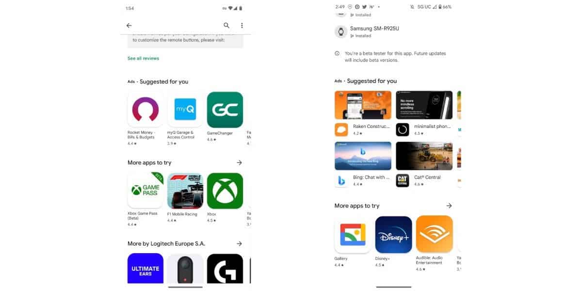
Earlier this month, we reported that Google is testing new ad placements in the Play Store. Looks like Google is taking this initiative very seriously. Android Police has recently shared a few screenshots about how Google might implement its new ad layout. While some users may find this annoying, it is understandable that Google is trying to find new ways to generate revenue. After all, advertising is the backbone of Google’s business.
Ads in Google Play Store
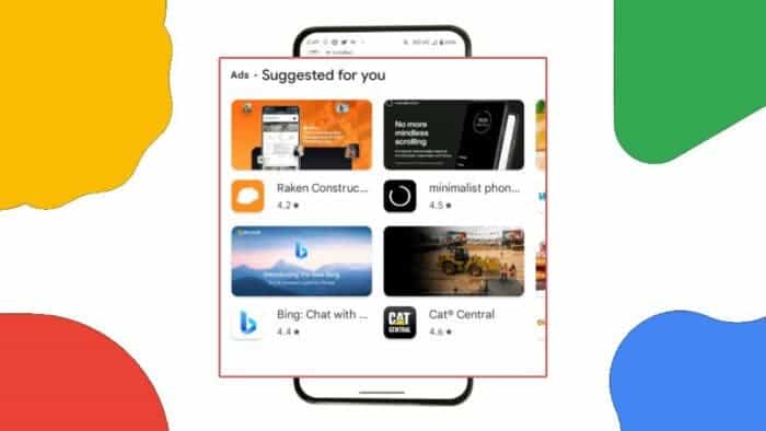
Google Play Store, which is viewed daily by millions of people, is a goldmine for advertisers. Google has been steadily increasing the number of ads on the Play Store, and the latest change is a two-row carousel of banners that appears after you install a new app. The screenshot comes from the user Moshe via Android Police.

At a quick glance, things may not appear as disastrous as you’d expect. However, upon closer inspection, you’ll notice a new section labeled “Suggested For You.” Previously, users were only able to view a maximum of three apps at a time.
Now, users are greeted with ads displayed in two rows. These are accompanied by expanded thumbnails of the apps. This change allocates a significant portion of the screen to the ad section banner. Unfortunately, the “More apps to try” and “More by the developer” sections have been pushed further down, which makes it harder to find new apps.
Google has also recently begun displaying ads in the Play Store search bar. So, this is a clear sign that the company is eager to show ads in as many places as possible. It is unlikely that this trend will slow down anytime soon. Hopefully, Google will stop before the Play Store becomes too cluttered with ads. Some people might argue that the Play Store is already a bloated mess.


