Google Messages is introducing a redesigned compose text field with a dedicated shortcuts bar. As of January 30th, this redesign has been widely rolled out to the stable channel, marked as version 20240116_01_RC04.
In an update on January 27th, there were reports that the new RCS (Rich Communication Services) and text message field is starting to appear for users that do not enroll in the Google Messages beta program. Unlike some previously announced features in late November, Google did not provide detailed information about this particular change. Some features, such as Photomoji and Magic Compose, have already exited beta and are available widely. However, capabilities like Custom Bubbles, Voice Moods with a redesigned recorder, and Profiles are not yet widely accessible. Users can expect these updates to enhance their messaging experience on the Google Messages platform.
As of December 14, 2023, the new message field is becoming more widely available for users in the beta program. While the standalone button for the redesigned voice recorder with Voice Moods is present, it is not yet available to most users. The same applies to features like Custom Bubbles and Profiles.
Historically, the RCS/Text message field occupied the right two-thirds of the screen, expanding to conceal the “plus,” gallery, and Magic Compose buttons as the user enters more text. On the opposite end, users have access to emoji and voice memo shortcuts. The ongoing updates aim to provide users with a more enhanced and versatile messaging experience within the Google Messages app.
A New Text Field for Google Messages

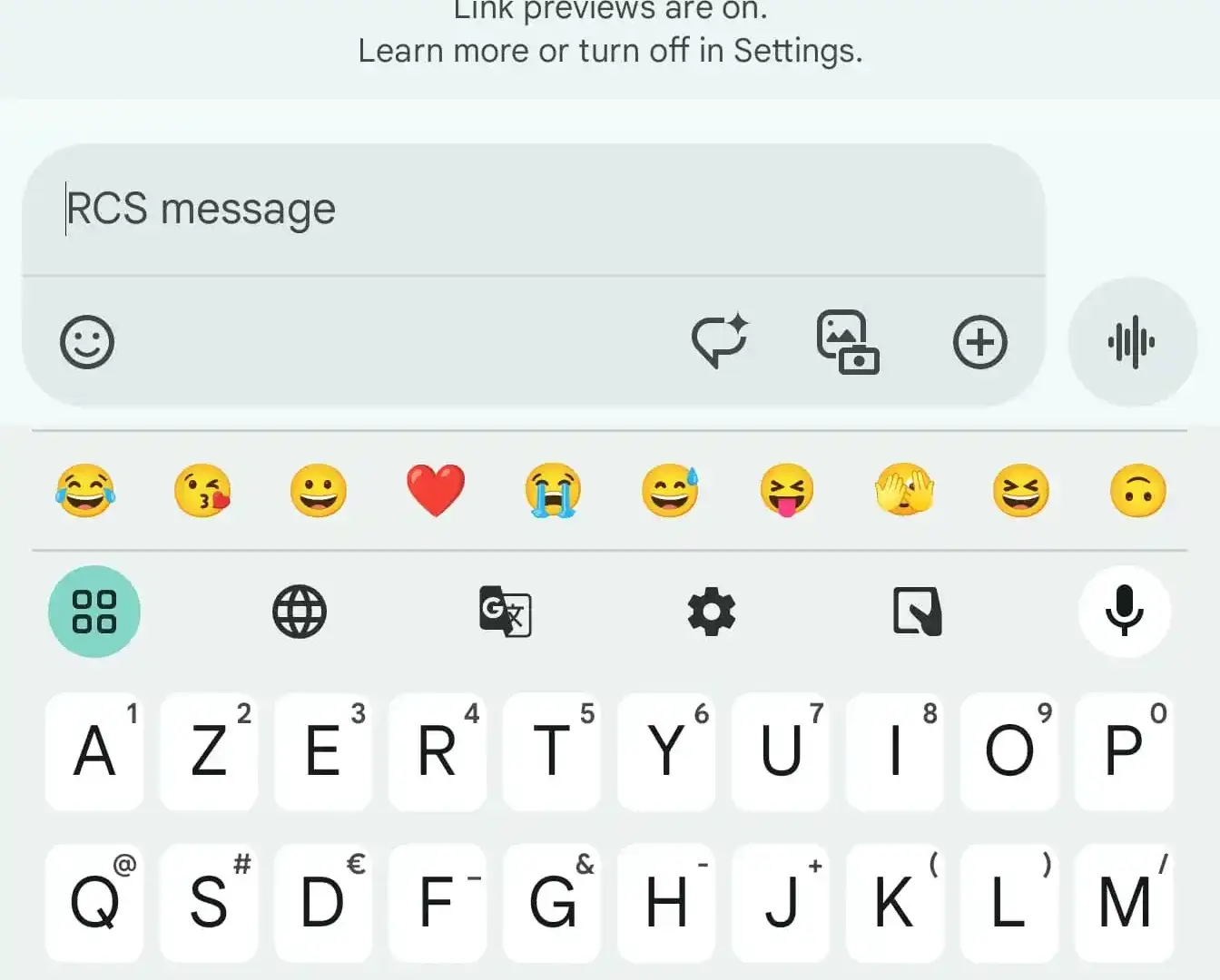
Google Messages is undergoing a notable redesign, shifting to a left-aligned text field where the emoji button takes the lead. Following the emoji button, users now have access to Magic Compose, a gallery with a new icon, and the plus button, which has now moved to the opposite end. The voice recorder, undergoing a thorough revamp with Voice Moods, now has its dedicated button outside the message input pill.
Some users have pointed out that it’s somewhat peculiar for the text field to align to the left while the messages sent still appear on the right.
Additionally, when users start typing, a new user interface (UI) emerges, split into two lines. The text field now stays at the top, while a bar keeps all the shortcuts on the same strip. This introduces a slightly more complex and denser interface that might require some time for users to adapt to the changes.
Availability of Google Messages Redesigned Text Field 
As of now, only some users in the Google Messages beta program are experiencing the text field redesign with the dedicated bar. It has not been widely rolled out, and this is consistent with the status of other functionalities Google has announced earlier in the week. The staggered rollout allows Google to test these changes with a smaller audience before making them available to a broader user base. Users can anticipate these updates to reach a wider audience once Google ensures a smooth and reliable experience based on feedback from beta users.


Having distinct colors for each bar would enhance visual clarity, aiding in easier navigation and comprehension of the interface. Distinguishing them visually can improve user experience and streamline interaction 😀.