Samsung One UI 9: Which Galaxy Devices Are Getting Android 17
May 14, 08:59
Ausom DT2 Pro Brings Smarter Urban Mobility to Match-Day Travel
May 15, 02:24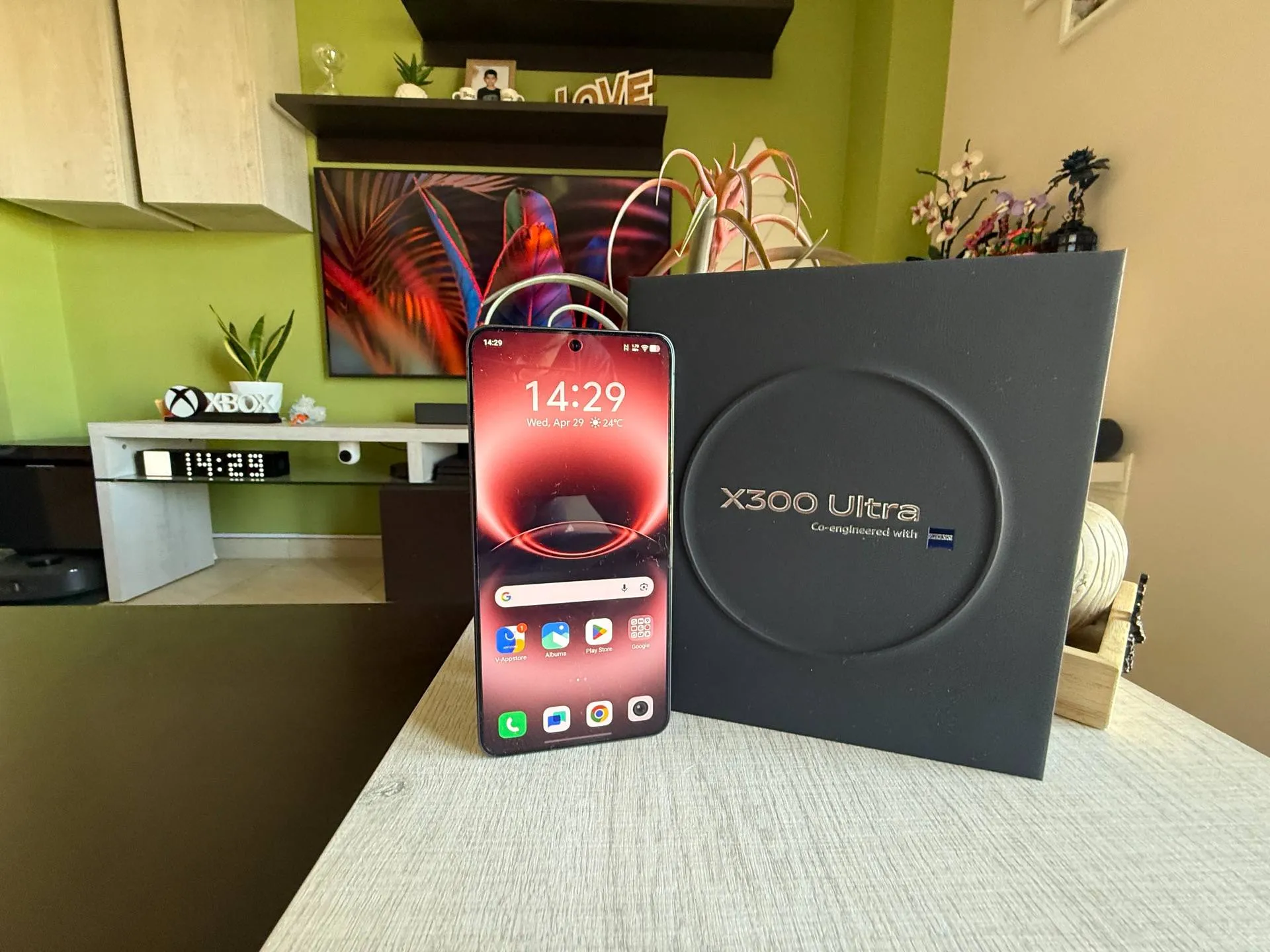
A "Snap" Above the Rest: Why the Vivo X300 Ultra is a Photographer's Dream
May 14, 01:53
Xiaomi Teases New Open-Ear Earbuds and Redmi Headphones Neo for May Launch
May 13, 09:25
Nubia GT Buds Launch at 269 Yuan — RGB Case, 35dB ANC, and 40-Hour Battery
May 12, 10:03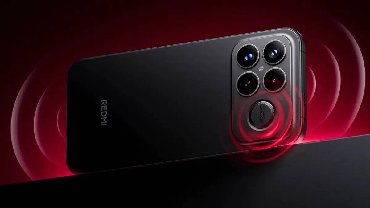
Redmi K100 May Beat the Xiaomi 18 to Market — and That Creates a Problem
Digital Chat Station tips Redmi K100 series for Q3 2026 — potentially September, the same month as Xiaomi 18. Here's what the scheduling overlap means for both lineups.
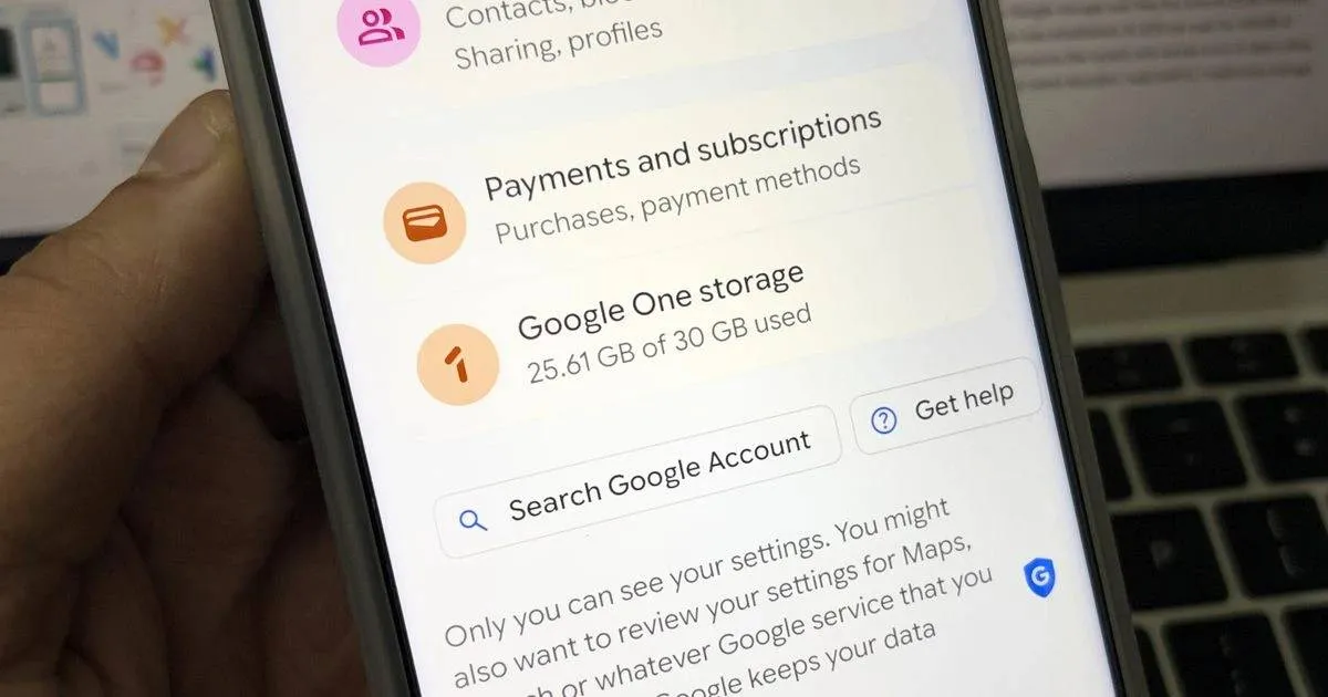
The Era of 15GB Free Google Storage Is Coming to a Close
Google is testing a 5GB default for new accounts — the full 15GB now requires phone verification. Change traced to March 2026, currently active in Kenya and Nigeria.
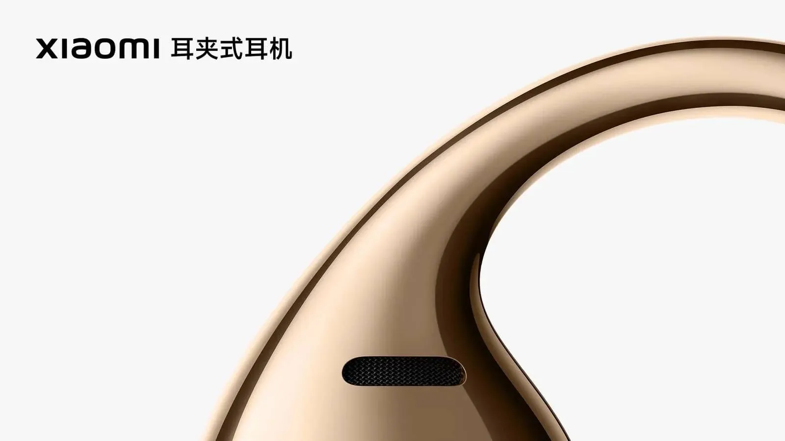
Xiaomi's First Clip-On Earbuds Are Coming May 21
Xiaomi's first clip-on earbuds launch May 21 with a transparent speaker sphere, mirror finish, and a charging case with a built-in Find My Device speaker.
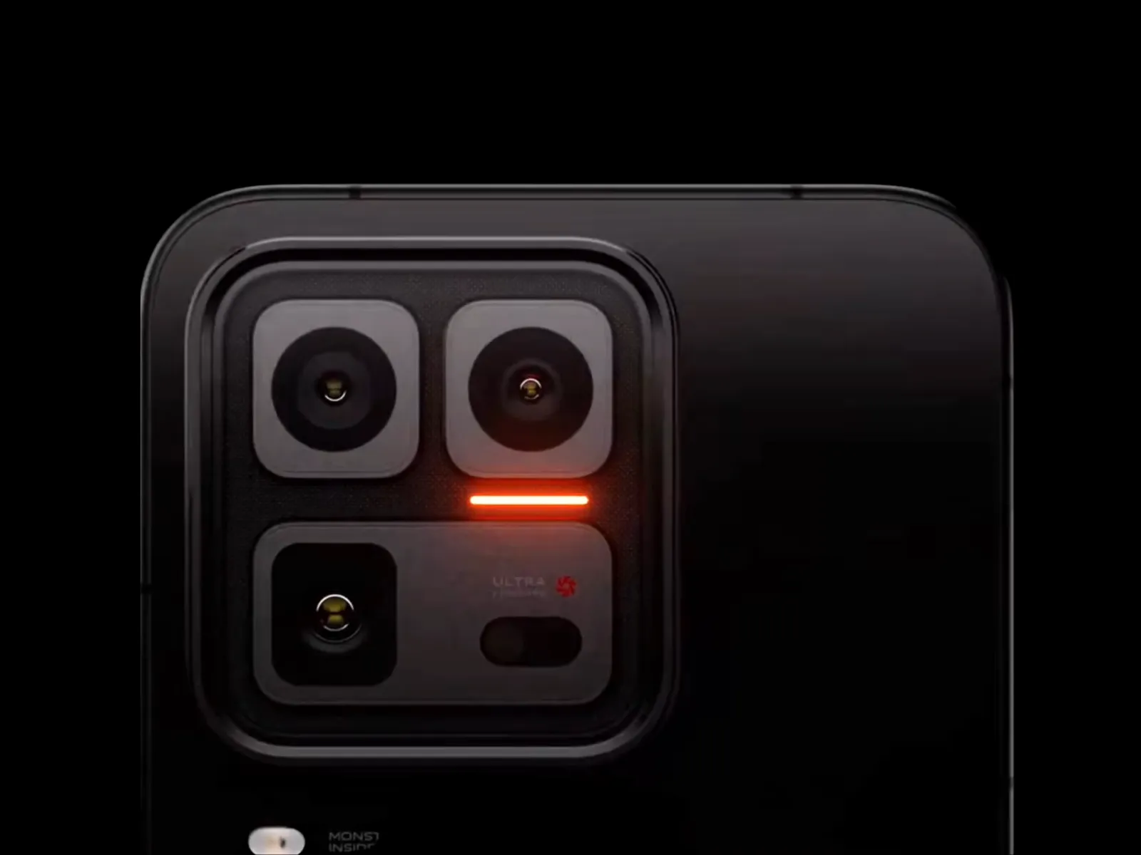
iQOO 16 Camera Leak: A 1/1.3-Inch 50MP Main Sensor and a Periscope Telephoto Take Shape
iQOO 16 leak reveals a 50MP 1/1.3-inch main camera and periscope telephoto — but iQOO is still deciding between 50MP and 200MP for the primary sensor.
- "1/1.5-inch"? So it's a 2/3-inch sensor? If so, that's the strangest expression of that fraction I've ever seen.FeRDNYC10-05-2026
- If I have any criticisms, they are: 1) no DisplayPort, 2) audio out as analog mini-headphone only, and 3) (admittedly minor, but...) one of the USB ports on the back is USB 2.0 only, the other is USB 3.2. But they are both colored blue, so have fun guessing which is which. Color coding standards exist for a reason!FeRDNYC10-05-2026
- I'm shocked that the RAM is both DDR4 and removable. That makes this a pretty interesting system, since it's possible to buy with a conservative RAM load out for now, then upgrade once the current RAM crisis has passed.FeRDNYC10-05-2026
- All real Samsung users know this feature was around when the S10 was out, it was a Good Lock feature.drksun08-05-2026
- We hope that the Xiaomi Red Mi 17 brand in all its categories will change the shape and location of the rear camera island and place it on the left of the phone or make it in a straight line next to each other.Egyptian28-04-2026
- Why don't we watch IQO brand tabletsEgyptian28-04-2026
- We wish that the T7000 mAh battery and the T-Pro 8500 battery will be as described in the previous report.Egyptian27-04-2026
- The 6360mAh points to a 6500mAh rated capacity. There is high risk the 17T Pro uses the same one, but some OS data pulls point to 7000mAh for the Pro version. I hope they don't downgrade the main sensor from OV50H/LF900 to the smaller one. The competition is tough. Even with OV50H, periscope telephoto, 13Mpx UWA without AF and 6500/7000mAh battery it will be an uphill battle and tough sell.. The fan specs is probably a mixup with Redmi K90 Max.crashpc27-04-2026
- Unfortunately, we don't want these products in the Arabian Gulf, the Honor Magic Pad 3Pro.Egyptian22-04-2026
- Waiting for the next Sony giant and we hope to see it in the Middle East and the Arabian Gulf as wellEgyptian05-04-2026

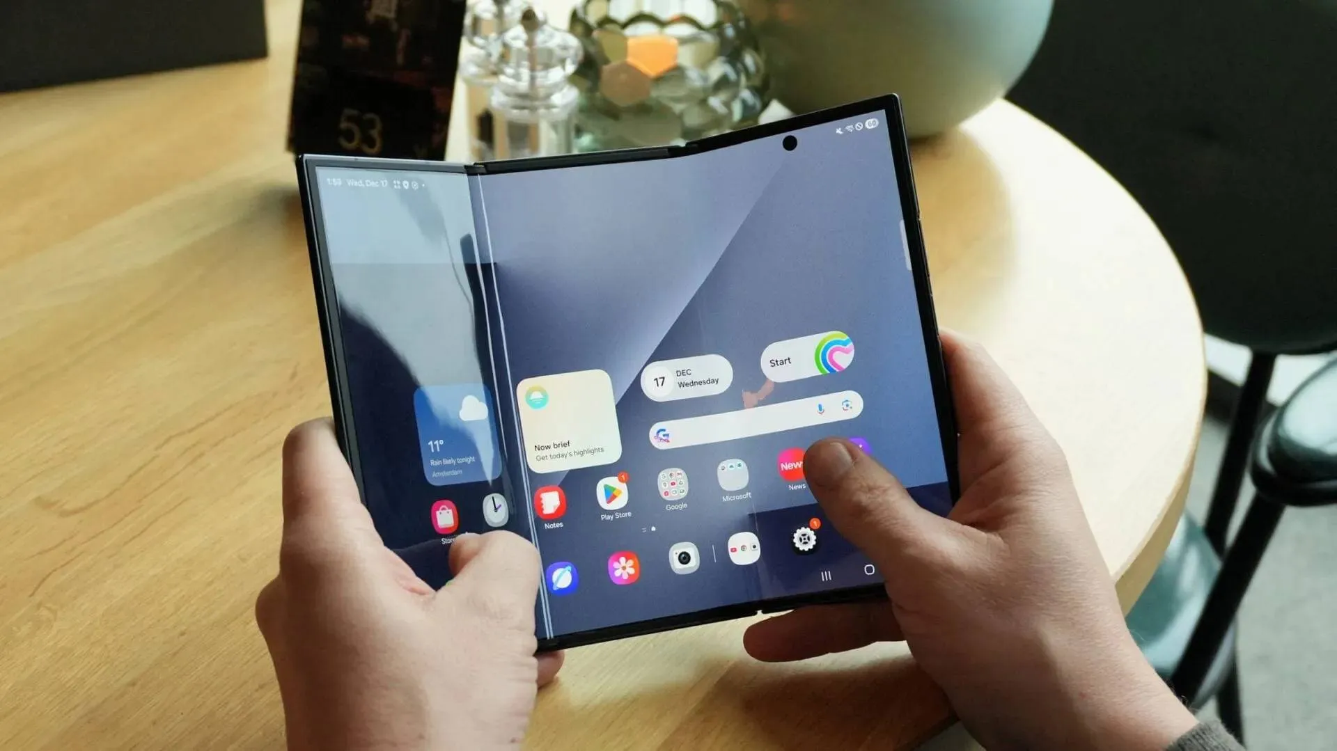
Samsung One UI 9: Which Galaxy Devices Are Getting Android 17
Samsung's One UI 9 beta is live for Galaxy S26 series, with stable launch confirmed for July 22. Here's the full eligible device list from S26 to Galaxy A06 5G.

6 Strange But Impressive Smartphones We've Seen in the Past Months
Discover the weirdest smartphones of 2026 so far, from robotic cameras to liquid cooling and dual screens. These phones break the usual mold.

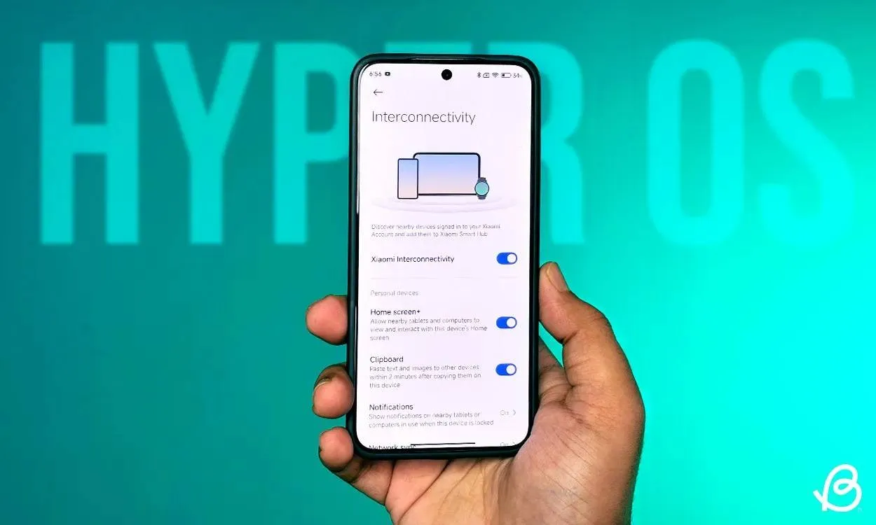
Xiaomi Releases Android 17 Beta With HyperOS 3.3 — Four Devices Eligible Right Now
Xiaomi's Android 17 Developer Preview is live with HyperOS 3.3 for Xiaomi 17, 17 Ultra, Leica Leitzphone, and 15T Pro — here's how to install it now.
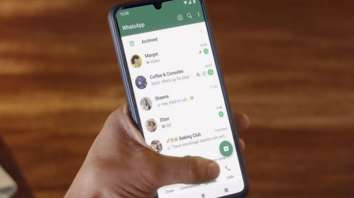
Top 6 WhatsApp settings to turn on to keep your account safe and how to activate them
WhatsApp is where most of our daily talks happen. Chats with friends, work updates, photos, and even bank alerts all go through it.
Loading


