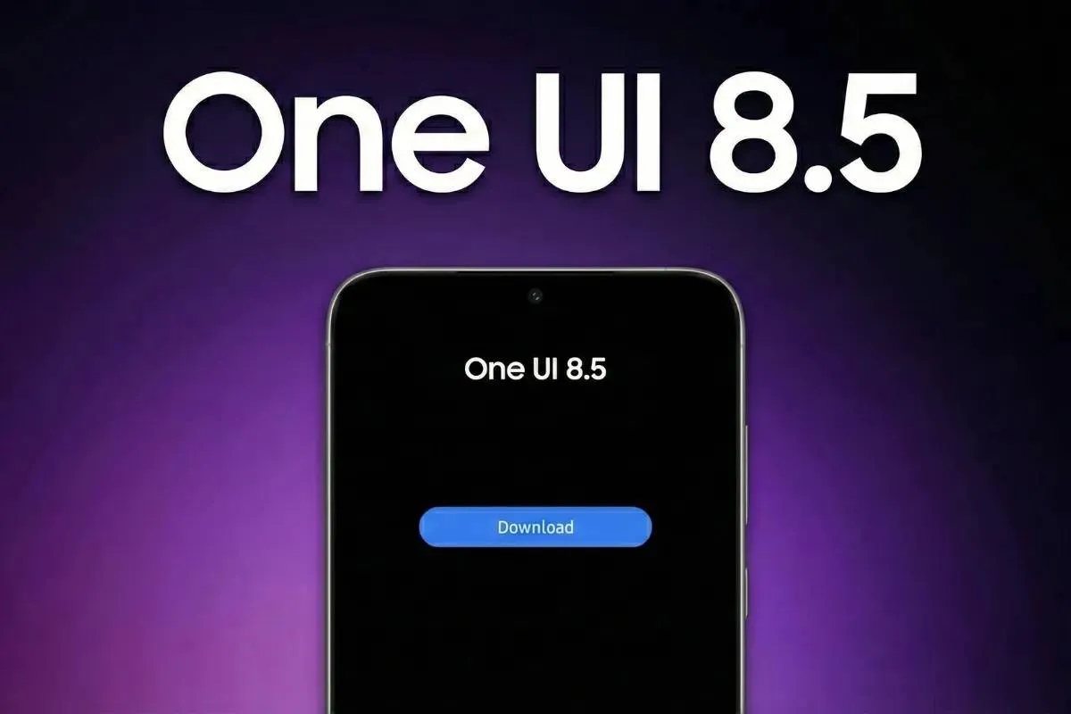
One UI 8.5 Keeps Rolling — Four More Galaxy Phones Get the Update Today!
May 19, 08:34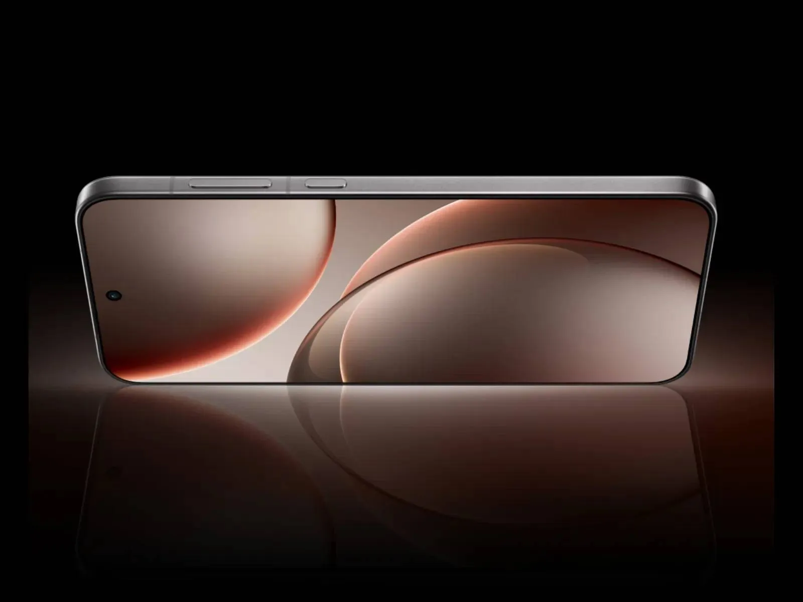
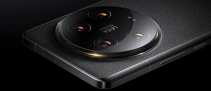
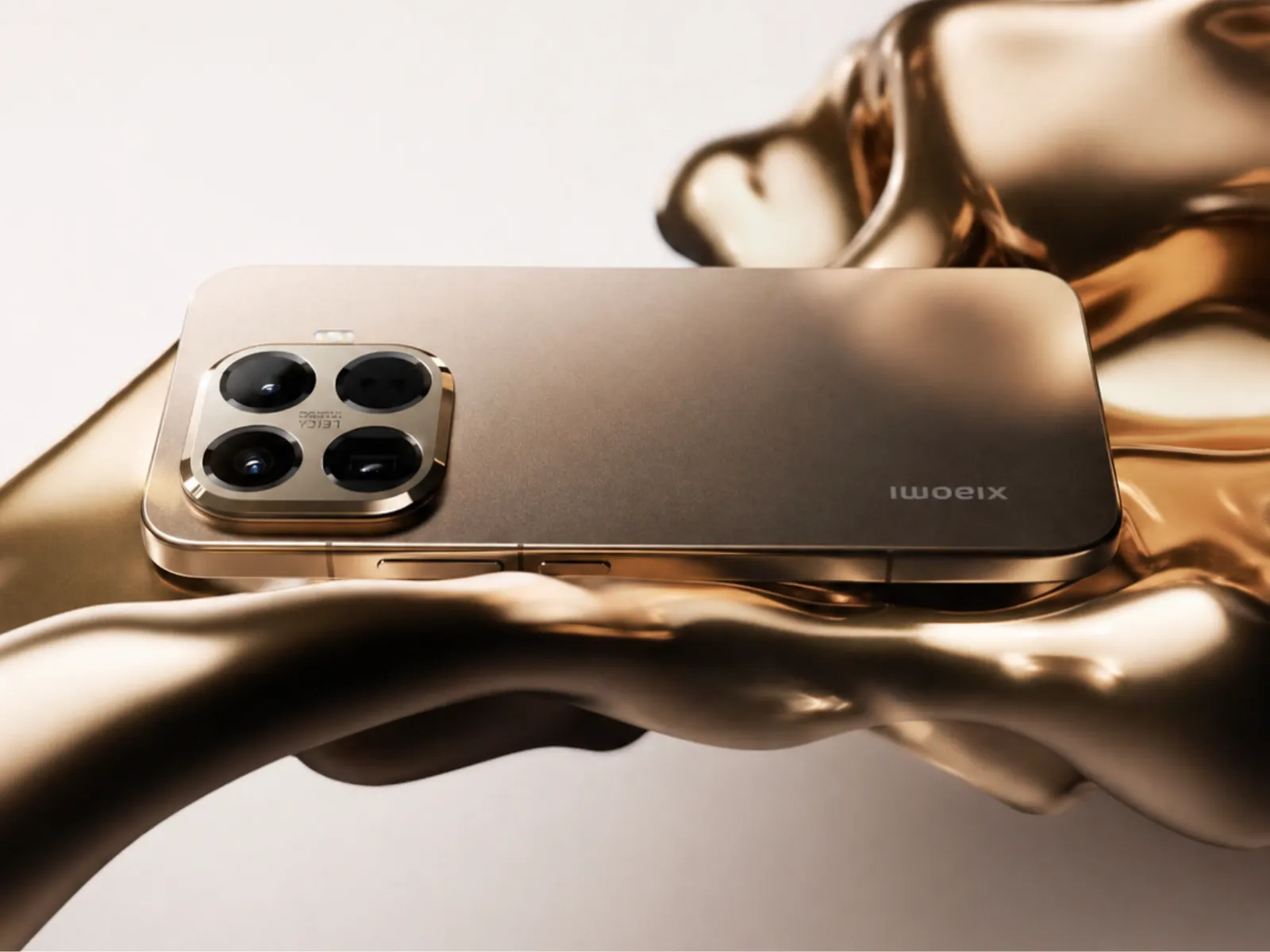
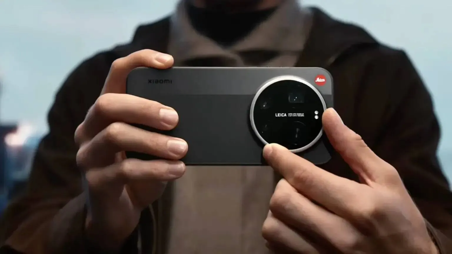
OPPO's Find X10 Ultra Is Getting a Camera Nobody Else Has
May 19, 09:27
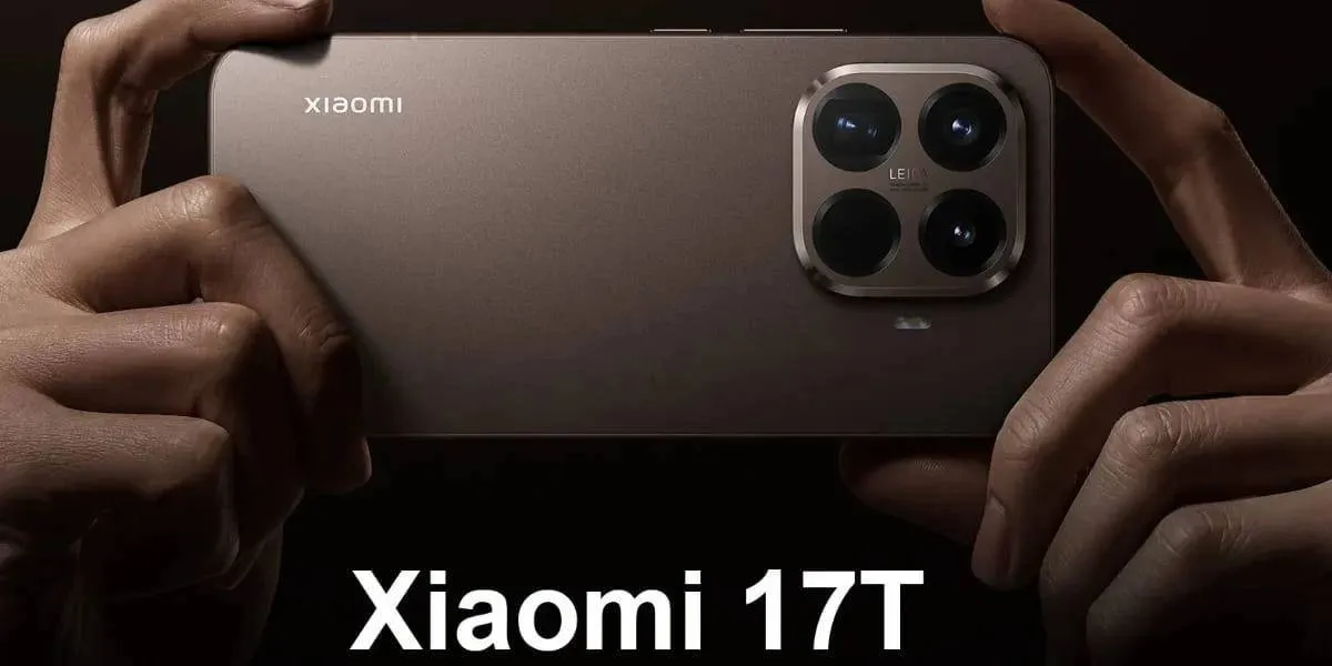
Redmi K100 Pro Leaks: 9,000mAh Battery and Three Models Now Taking Shape
May 19, 08:53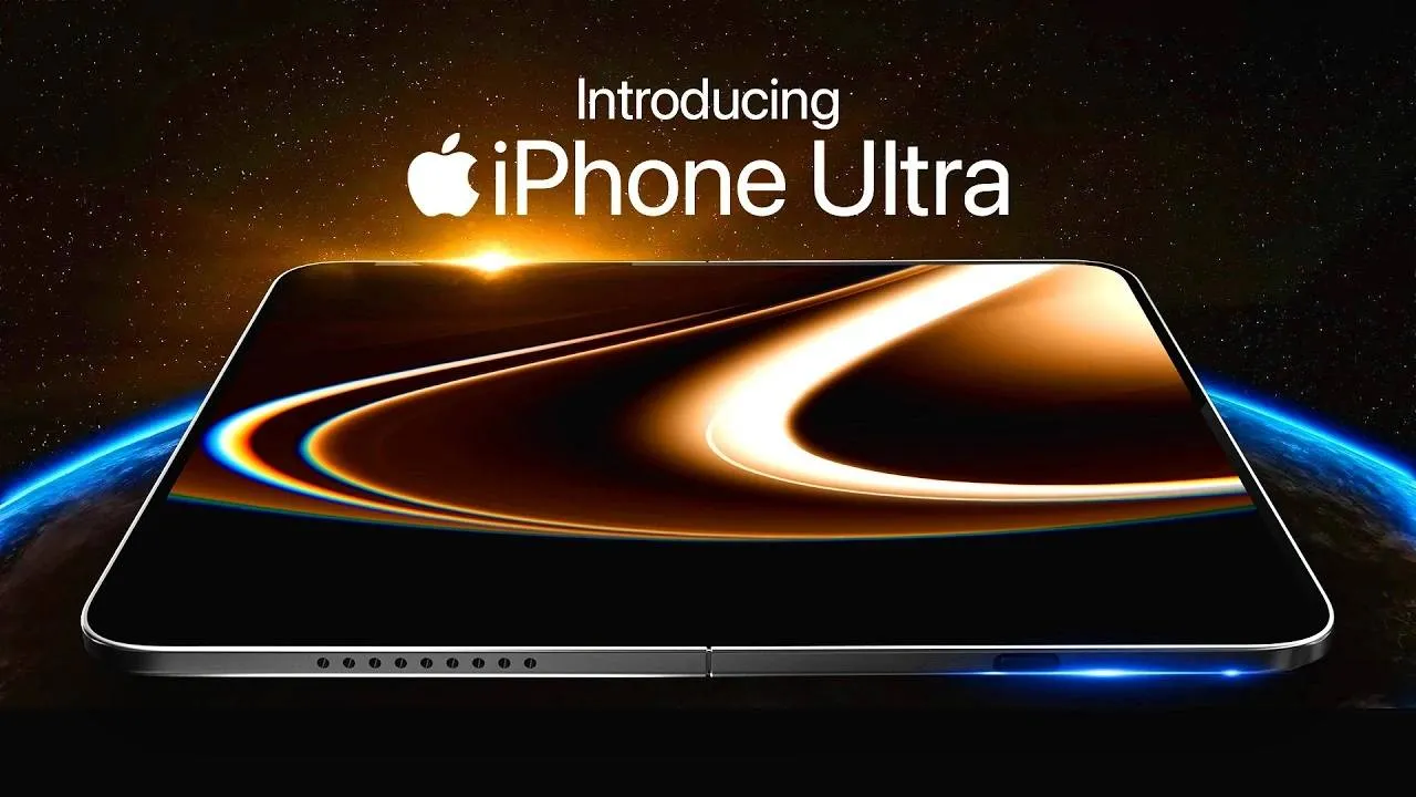
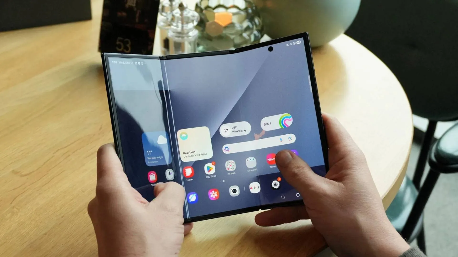
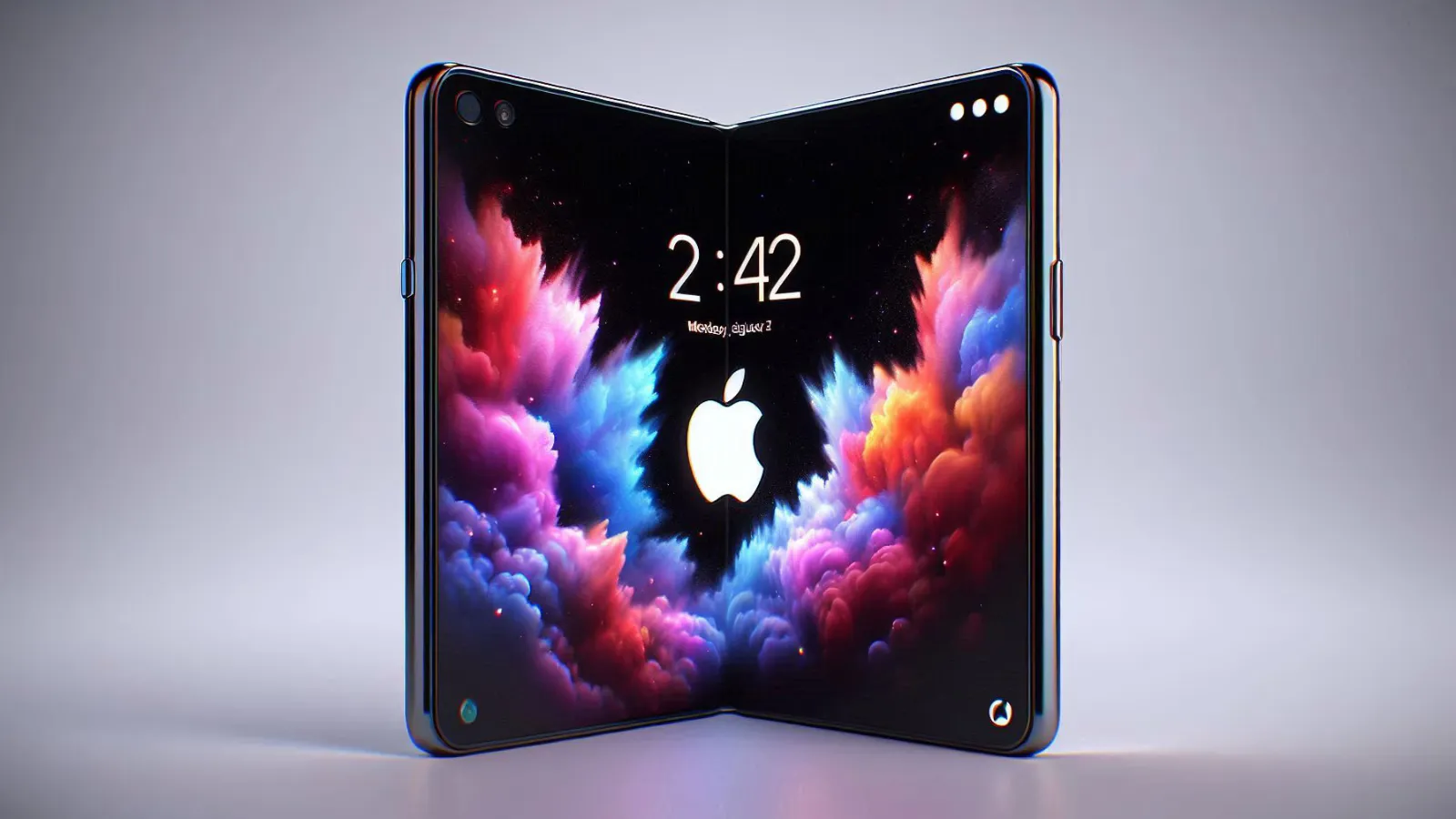
Apple's Foldable iPhone Is 4.5mm Thin When Open
May 18, 09:49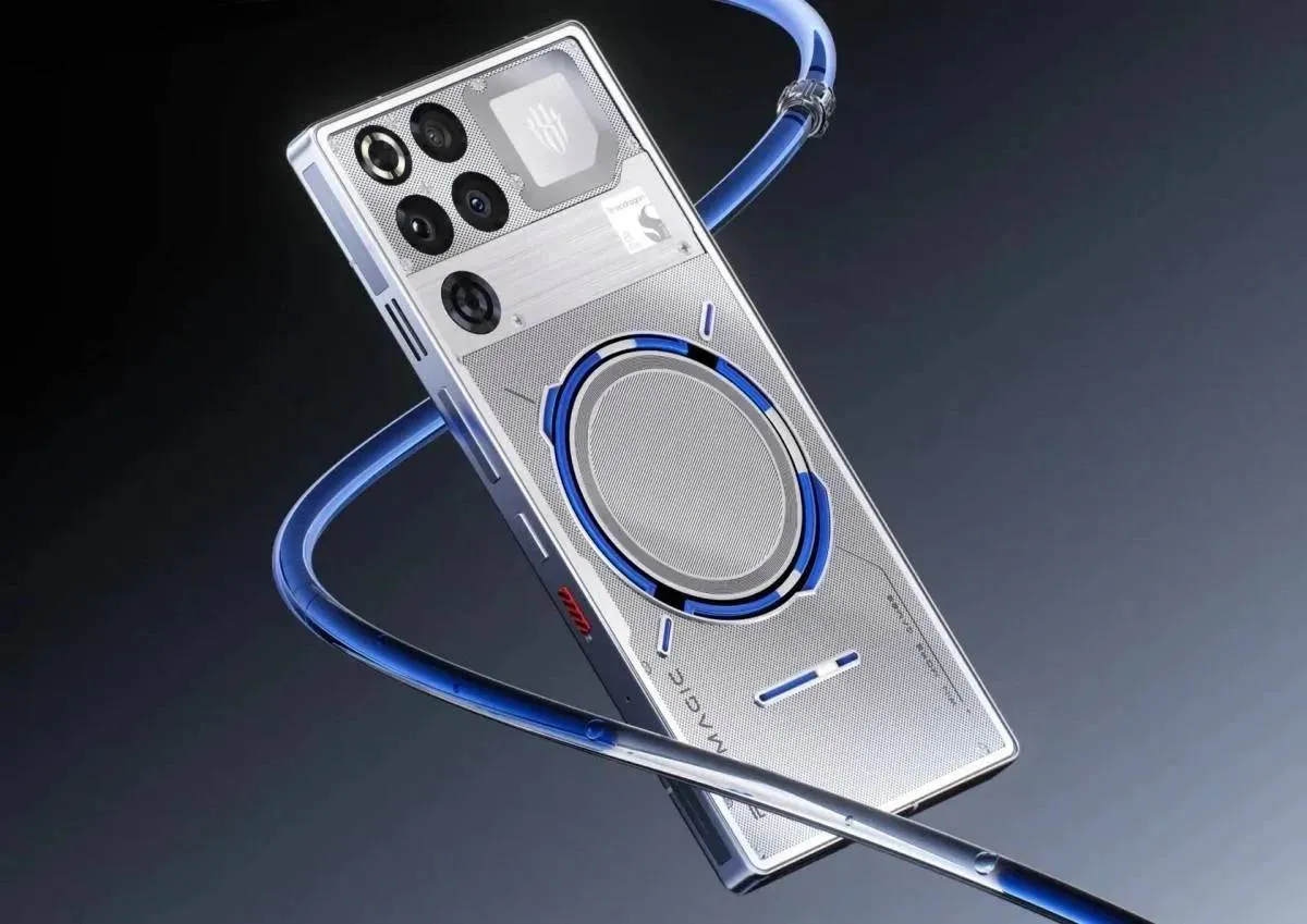
Red Magic 11S Pro+ Is Coming in May
May 18, 09:38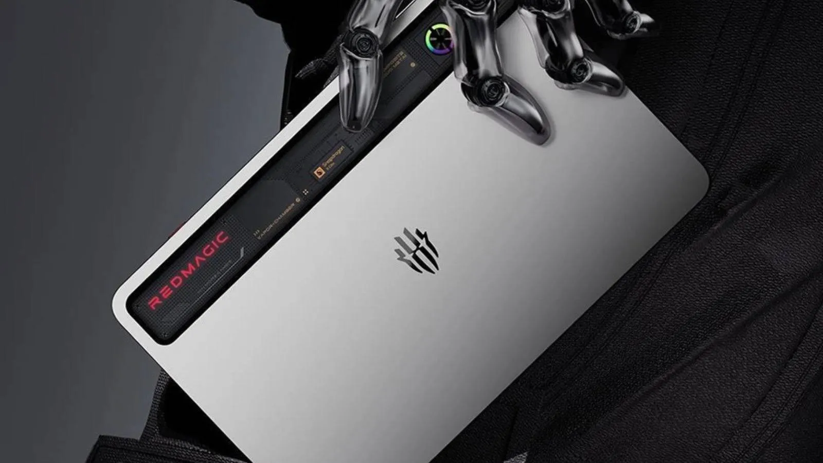
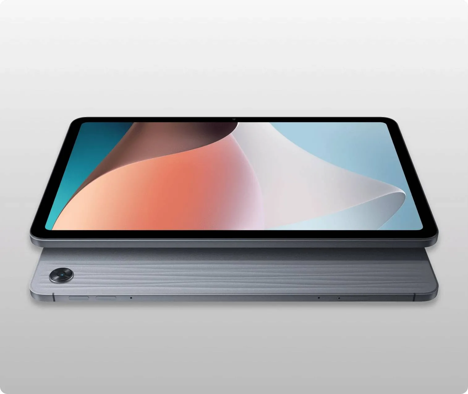
RedMagic's Next Gaming Tablet Is Coming in June
RedMagic confirmed the Gaming Tablet 5 Pro launches in June 2026, with leaked specs including 185Hz OLED, Snapdragon 8 Elite Gen 5, 24GB RAM, and liquid cooling.
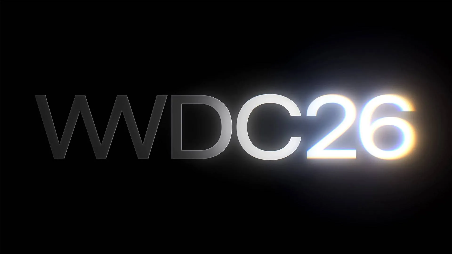
Apple's Final Tim Cook Keynote Is on June 8
Apple WWDC 2026 runs June 8 to 12. Tim Cook hosts his final keynote before handing the CEO role to John Ternus. iOS 27 betas drop the same day. Full preview here.
OPPO's Find X10 Ultra Is Getting a Camera Nobody Else Has
OPPO is testing a 200MP LOFIC Samsung sensor exclusively for the Find X10 Ultra, plus a 100MP square selfie camera. Find X10 Pro Max targets triple 200MP in October 2026.
Redmi K100 Pro Leaks: 9,000mAh Battery and Three Models Now Taking Shape
Redmi K100 Pro leaked with ~9,000mAh battery, 100W wired and wireless charging, and Snapdragon 8 Elite Gen 5. Lab testing even larger cells. October 2026 China launch.
- How much is the price of the Oppo Pad 4 Pro tablet?Egyptian18-05-2026
- Will Xiaomi use raw Android from the beginning of 2027?Egyptian18-05-2026
- No Beta program registration is open in Members app from my s26ultralorrshaw16-05-2026
- "1/1.5-inch"? So it's a 2/3-inch sensor? If so, that's the strangest expression of that fraction I've ever seen.FeRDNYC10-05-2026
- If I have any criticisms, they are: 1) no DisplayPort, 2) audio out as analog mini-headphone only, and 3) (admittedly minor, but...) one of the USB ports on the back is USB 2.0 only, the other is USB 3.2. But they are both colored blue, so have fun guessing which is which. Color coding standards exist for a reason!FeRDNYC10-05-2026
- I'm shocked that the RAM is both DDR4 and removable. That makes this a pretty interesting system, since it's possible to buy with a conservative RAM load out for now, then upgrade once the current RAM crisis has passed.FeRDNYC10-05-2026
- All real Samsung users know this feature was around when the S10 was out, it was a Good Lock feature.drksun08-05-2026
- We hope that the Xiaomi Red Mi 17 brand in all its categories will change the shape and location of the rear camera island and place it on the left of the phone or make it in a straight line next to each other.Egyptian28-04-2026
- Why don't we watch IQO brand tabletsEgyptian28-04-2026
- We wish that the T7000 mAh battery and the T-Pro 8500 battery will be as described in the previous report.Egyptian27-04-2026

Apple's Foldable iPhone Is 4.5mm Thin When Open
iPhone Ultra leaks confirm 4.5mm unfolded, 9mm folded, A20 Pro chip, near-zero crease, and Touch ID. But no telephoto and possibly no internal MagSafe. Full breakdown.

6 Strange But Impressive Smartphones We've Seen in the Past Months
Discover the weirdest smartphones of 2026 so far, from robotic cameras to liquid cooling and dual screens. These phones break the usual mold.


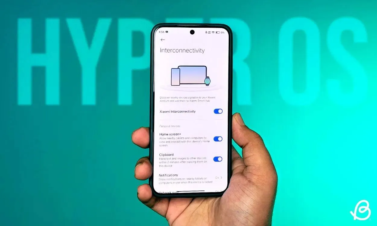
Xiaomi Releases Android 17 Beta With HyperOS 3.3 — Four Devices Eligible Right Now
Xiaomi's Android 17 Developer Preview is live with HyperOS 3.3 for Xiaomi 17, 17 Ultra, Leica Leitzphone, and 15T Pro — here's how to install it now.

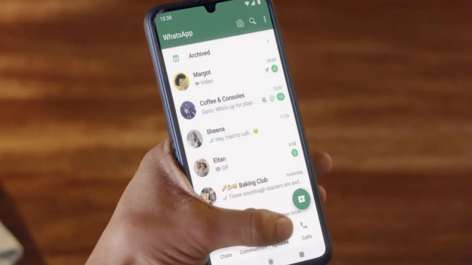
Top 6 WhatsApp settings to turn on to keep your account safe and how to activate them
WhatsApp is where most of our daily talks happen. Chats with friends, work updates, photos, and even bank alerts all go through it.
Loading