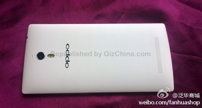
5 days till launch and counting, but the Oppo Find 7 cat is already out of the bag! Up close, spy photos give us the best look at the Oppo Find to date!
The Oppo Find 7 is one of the most talked about smartphones currently. We have seen official teasers, renders, photos of the phone at a distance and even the rear of an early purple unit, but these leaked spy photos are the best look at the flagship phone to date!
According to the reports which come along with the images, this is the FHD 1920 x 1080 version of the Oppo Find 7 rather than the top-of-the-range 2K QHD model. Those who have had their hands on with the phone say it has a Qualcomm Snapdragon MSM8974AB, with 2GB of RAM, 16GB of internal memory and a 5 mega-pixel front facing camera. Details of the rear camera have been undetermined so we still don’t know if the Find 7 will have a 50 mega-pixel camera or not.

Looking at the photos of the Find 7, there is nothing which really strikes us about the design. We can make out the small silver pin on the bottom right which will unlock the rear panel (a feature similar to the Meizu MX3).
Gizchina News of the week

The front of the phone is typical [easyazon_link asin=”B00C0N09MY” locale=”UK” new_window=”default” nofollow=”default” tag=”gizchicom-21″ add_to_cart=”default” cloaking=”default” localization=”default” popups=”default”]Oppo[/easyazon_link], and isn’t too far away in the looks department to some of Oppo’s more affordable smartphone offerings.

The white rear (on this model) has the rear camera, a dual LED flash and large external speaker. We can also make out the 3.5mm headphone jack at the top too.
This being the 1080 version of the Oppo Find 7 we wonder if [easyazon_link asin=”B00C0N09MY” locale=”UK” new_window=”default” nofollow=”default” tag=”gizchicom-21″ add_to_cart=”default” cloaking=”default” localization=”default” popups=”default”]Oppo[/easyazon_link] have a few design surprises in store for the flagship 2560 x 1440 version of the phone? What do you think of the Oppo Find 7? Excited or disappointed?
[ Weibo ]


Wow thick bezels.
So normal ! So disapointed ! Nothing special !
i think the 2k version will be more premiuim. this is going to be the phone who is taking the place from find 5 for 349 or 399$
I’m actually quite pleased by the overall design. Nothing too special, but the side bezels are pretty thin and the back is clean and minimalistic with a finish that seems similar to the Oppo N1. It’s not groundbreaking like the Find 5 or HTC One, but it’s an all around crowd pleaser and pretty hard to hate.
love the design being former oppo find 5 user.
solid premium and square ish!!!!
but when it comes to rom and software, oppo is far from the game. for even basic function its buggy. video cam reduce to really low quality when moving indoor. original cooloor os steadily and consistently in beta version!!!! thats rite. beta for us always.
eye candy ear catching features. but no real solution. battery drain. even cyanogen mod for find 5 is buggy in the basic function. what kind of phone is this??? community phone! they said.
I am very disappointed from oppo nothing interest about this phone looks huge and ungly my only hope right know is the oneplus one project
it will fail anyway
Wow. You must really hate Oppo to say that.
Don’t know why but I was expecting more so I’m a little bit disappointed
its called, hype
I really can’t stand the UI design on the oppo phones its truly ugly
being a partner of cyanogen mod i expect it to get cm 11
It’s not too suited for the western audience, I guess. Large and rounded icons with bright colours are pretty popular with consumers here, which is why Chinese brands like Oppo, Xiaomi and Lenovo have UIs like these. Personally, I don’t think ColorOS is even ugly at all, especially next to TouchWiz.
I’m a bit disappointed as the bezels are wider than LG G2 and Note 3.
design is not surprising but looks good. All I’m really hoping for is a low light camera.
No on-screen buttons to clutter and clog the screen; this is good and makes the substantial bottom bezel excusable. The rest of the bezels look good imo. I like the panda colors. Just hope the back doesn’t collect fingerprints too much. Its crazy how high standards people hold the design to after all the good news already coming in about this phone.
Don’t mind the design too much, a bit bland. But was expecting thinner bezels, surprised they haven’t moved to onscreen buttons, that bottom bezel is unnecessarily hefty when you compare to the LG G2
blur camera man again? .. where are my high resolution shots?
btw something is very strange, the bottom of the phone has a middle placed usb host which is very unlikely from oppo to do so
It’s a little bland, but very classy looking, especially if it has the very slick N1 finish.
What it’s not…
Fail plastic like the LG, or nasty leather in the hand or expensive like Samsung, Lenovo are way behind build wise, Nubia, Huawei, ZTE get close in this order and it’s only competition ATM is the Gionee, Z2 and maybe the plus one. Although I’ve held a X3S which was very awesome, hoping the 2K version is similar but more stylish and something special camera wise.
Here’s how I’d rank build quality from brands that utilize plastic.
1- Oppo (Find 5, N1)
2- Nokia (Lumia 920, 1520)
3- Meizu (MX3, MX2)
4- HTC (One X, One X+, 8S)
5- Huawei (Ascend P6)
6- Motorola and LG (Moto X, Nexus 5)
7- JiaYu and Early Sony (G3, G4, Xperia S)
8- Xiaomi (Mi3, Mi2)
9- Gionee and Lenovo (Elife E7 Mini, Lenovo Vibe X)
10- Samsung (Galaxy Note 3)
11- LG, ZTE, Sony and Huawei (LG G Pro, ZTE Grand S, Xperia C and Ascend Mate)
12- Samsung and Gionee (everything before Note 3 and Elife E7)
So much news about the 1080p version but not a peep or slip about the 2K version.
Are we sure there even IS going to be a 2K version? I know they announced it early in the development cycle, but are we sure they haven’t just switched to a 1080p screen and that there is only one version to be released?
They’ve confirmed there are 2 versions of the Find 7 on their Facebook page (if I’m not wrong). 🙂