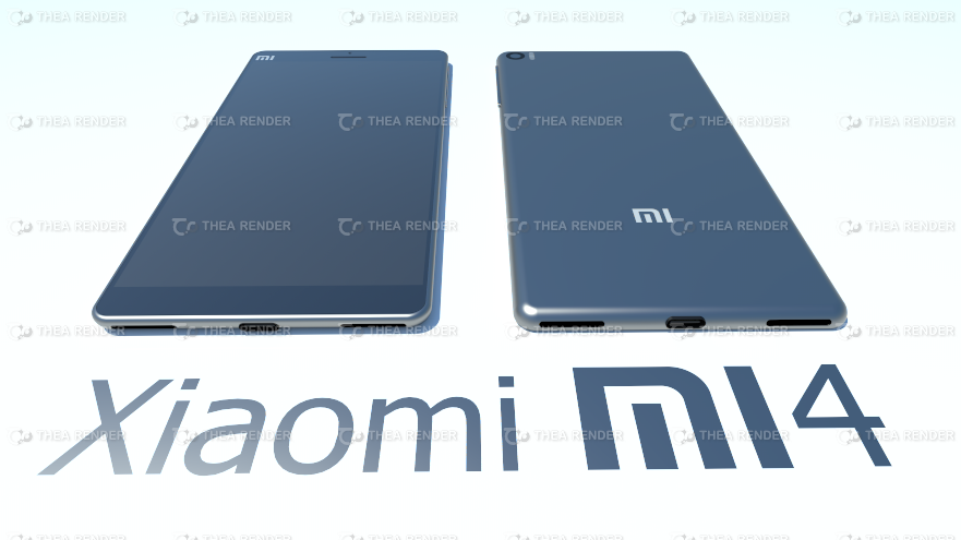
I think we can all agree that Xiaomi have the hardware:price ratio sorted but they still have a long way to go to improve design, let’s hope these fan made renders give the Xiaomi team some inspiration.
When the Xiaomi Mi3 launched we were all amazed by the level of hardware the Beijing phone maker had managed to cram in to such an affordable smartphone, but the design was really the missing link and a reason why I personally didn’t move to the current Mi flagship phone. It’s not that the Mi3 is an ugly phone it is just way to bulky for the 5-inch display it has to offer.
The Mi4 will no doubt continue the high spec low-cost tradition of previous Xiaomi phones, but we also hope the design of the device will be up to scratch too. Xiaomi fans also have a similar hope and have already started to produce their own renders, the most attractive being the one shown here.
Gizchina News of the week
Apparently made of an alloy material, the Mi4 concept has a slim design, power switch on the top, opposite a IR blaster and 3.5mm headphone jack and dual speakers in the base. The designer has even speculated on the internals of the phone suggesting the Xiaomi Mi4 could use a Snapdragon 810 processor, 5.5-inch 2K display, 4GB RAM, up to 128GB of internal memory and large 3200mAh battery.
Hopefully Xiaomi’s designers are taking a look at this and other renders and taking inspiration from them.
[ GizChina.es ]


Nice.
I hope this stays a render. The cut out holes for the speakers and USB port look hideaous and kill the design on the edges. One speaker at the back is the worst but 2 at the bottom is also no use when using landscape. Also with no rounded edges at the side this design will still feel bulky.
Hopefully more renders will follow but as the MiPad looks like an plastic iPad Mini I fear the worst for Xiaomi design.
Yes please, those speaker are also better located than most phone (i.e. in the back). Far better than Mi3.
Mitu, u do better? this render is awesome
Xiaomi, 74mm wide, please 🙂
What will the front facing and rear view camera specs likely to be ?
Nice.
I hope this stays a render. The cut out holes for the speakers and USB port look hideaous and kill the design on the edges. One speaker at the back is the worst but 2 at the bottom is also no use when using landscape. Also with no rounded edges at the side this design will still feel bulky.
Hopefully more renders will follow but as the MiPad looks like an plastic iPad Mini I fear the worst for Xiaomi design.
Yes please, those speaker are also better located than most phone (i.e. in the back). Far better than Mi3.
Mitu, u do better? this render is awesome
<no <no <no 5.5 Zoll is to BIG, 5.0 Zoll is OK !!!!
Xiaomi, 74mm wide, please 🙂
What will the front facing and rear view camera specs likely to be ?
<no <no <no 5.5 Zoll is to BIG, 5.0 Zoll is OK !!!!
So, I was thinking that, it is about to be release by this June 3
But seems like I need to wait for some more months coz it is still in designing phase ?
So, I was thinking that, it is about to be release by this June 3
But seems like I need to wait for some more months coz it is still in designing phase ?
who did this render??
who did this render??