[GizPoll of the Week] Periscope structure or slide-screen design - Which do you prefer?
xiaomiSaturday, 20 October 2018 at 04:47

From our last poll, black, blue and red phones are still the most popular smartphones colours. Twilight is becoming increasingly popular but the likes of pink, gold, and grey are not as popular.
The smartphone industry is consistently evolving and we get new innovations annually. Last year, Essential Phone got a higher screen-to-body ratio by using a teardrop notch. This notch was modified by Apple into the iPhone X-like notch. Now, may OEMs either use the waterdrop notch or wide notch for a better display ratio. We have also seen a pop-up camera design, like what we have in Vivo NEX. In this design, only the camera pops-up and there is practically no room for other sensors.

This year, Oppo Find X used a periscope structure to get a better screen-to-body ratio. In this design, the camera and other sensors are embedded in a periscope structure. The periscope slides-up when you click the camera app. With this design, the ultra-thin top bezel of the phone contains only the earpiece. This leaves room for a "true" full-screen smartphone. However, there are concerns that the automatic slide may experience wear after a while.
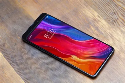
The slide-screen design, on the other hand, is a modification of what we had many years ago. Remember the slide phones? In which the phone display slides to reveal the physical buttons beneath? This slide-screen design is a better version of that design and we will see it soon with the Xiaomi Mi MIX 3. In this design, the user manually slides the display slightly and the camera/other sensors pops-out. This eliminates the fear of wearing out after a while since the operation is manual.
So, which of these designs do you think makes the cut for a "true" full-screen smartphone? The periscope structure of Oppo Fins X or the slide-screen design of Xiaomi Mi MIX 3. Let us know your thoughts in the poll below and if there is anything else you need to add, use the comments.
Popular News
Latest News
Loading
