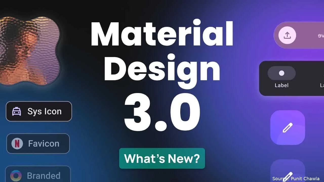
Google's Material Design has long been key to Android's visual and user experience. On July 16, developer Dylan Roussel tweeted about some yet-to-be-announced Material 3 parts, giving us a glimpse into the future of Android design. These new parts include upgrades to the floating action button (FAB) and its menu, as well as boosts to the top and bottom app bars. Let's dive into these updates and explore what they mean for users and developers.

Material 3 is Google's new design system, built on the ideas of Material Design. It aims to create a unified, adaptable, and attractive interface for apps on all devices. The goal is to make sure all apps feel consistent and user-friendly, no matter the platform.

New Floating Action Button (FAB) Upgrades
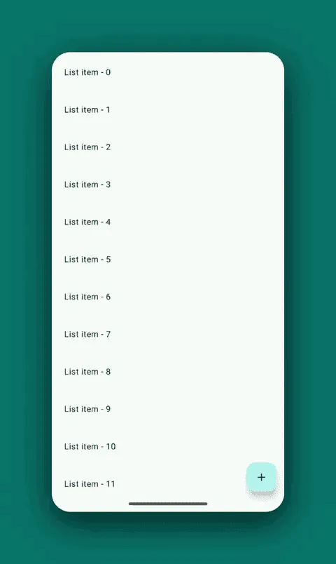
One of the standout features in the new Material 3 update is the upgrade of the floating action button (FAB). Google is adding a new medium FAB, which measures 80dp. This addition fits well with the existing small, standard, and large FABs, giving developers more choices to meet their design needs.
Existing FAB Sizes:
- Small FAB: Often used for secondary actions, like the camera or scan button in Google Drive.
- Standard FAB: Commonly seen as the main action button in many apps.
- Large FAB: Typically used for more important actions, like the recording button in the Pixel Recorder app.

The new medium FAB will fill the gap between the standard and large FABs, offering a balanced option for actions that are key but not primary.
The new Material 3 widgets are designed to be flexible, with both horizontal and vertical setups available. This allows developers to choose the best layout for their app's needs. When expanded, these widgets provide crucial tools for the current context, making sure users have easy access to the functions they need. These widgets can be hidden when scrolling, keeping a clean and uncluttered interface.
Optimized FAB Menu Options
Google has also optimized the FAB menu options in the new Material 3 update. The new menu options are designed to show extra operations with smooth animations. This not only makes the interface more dynamic and engaging but also helps users grasp the links between different actions.
For example, when a user taps the FAB, the menu might expand to show more options, each shown by an icon and a label. The animation ensures that the change is fluid and intuitive, making it easier for users to find and use these extra functions.
Split Button
Another exciting addition to the Material 3 parts is the split button. This new UI element is designed to enhance user interactions by giving a clear way to access multiple actions from a single button. The split button is very useful in cases where an action has multiple types or related sub-actions.

Example Use Case:
- Email App: In an email app, a split button could let users choose between replying to an email, forwarding it, or marking it as important, all from a single, easy-to-find button.
The split button simplifies the user experience by combining related actions into a single, clear interface element. This reduces the need for multiple buttons and helps keep a clean, uncluttered design.
Importance of Contextual Tools
One of the key ideas behind the new Material 3 parts is the importance of contextual tools. By giving tools that are relevant to the current context, Google aims to enhance the user experience and make apps more intuitive to use. The ability to hide these tools when scrolling further ensures that the interface stays clean and focused on the user's current task.
Benefits for Developers
The new Material 3 parts offer several benefits for developers:
1. Flexibility: With multiple FAB sizes and both horizontal and vertical setups, developers have more flexibility in designing their apps.
2. Consistency: The new parts help ensure a consistent look and feel across all apps, following the ideas of Material Design.
3. Ease of Use: Optimized menu options and the split button make it easier for developers to create intuitive and user-friendly interfaces.
2. Consistency: The new parts help ensure a consistent look and feel across all apps, following the ideas of Material Design.
3. Ease of Use: Optimized menu options and the split button make it easier for developers to create intuitive and user-friendly interfaces.
Impact on User Experience
For users, the new Material 3 parts promise a more engaging and intuitive experience. The upgrades to the FAB and its menu options, along with the split button, make it easier for users to access the functions they need. The focus on contextual tools ensures that users have the right tools at the right time, without cluttering the interface.
Conclusion
Google's new Material 3 parts mark a big step forward in Android design. By upgrading the FAB, optimizing menu options, and adding the split button, Google is making it easier for developers to create user-friendly and attractive apps. These updates not only benefit developers by giving more design flexibility but also enhance the overall user experience by making apps more intuitive and engaging.
As Google continues to refine and expand its Material Design system, we can expect to see even more innovations that push the limits of what's possible in app design. The future of Android looks bright, with a continued focus on creating unified, adaptable, and beautiful user interfaces.
Popular News


Latest News
Loading